

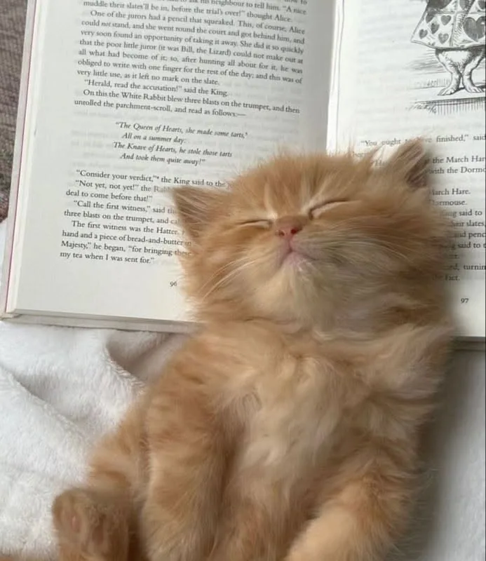
Most people drawing an orange kitten reading a book get the book wrong first — flat, floating, or fused to the paws — and the whole image collapses. This guide fixes the geometry, the fur, and the pose in that order, with specific measurements and tool settings you can apply in the next twenty minutes.
Advertisements1
- Draw the book before the kitten — the book's angle determines the head tilt, shoulder line, and lighting.
- Use three specific fur values (#E8913F base, #B85C2A shadow, #F7D9A8 highlight) and never mix shadows with gray.
- Lift the chest 15-20 degrees off the surface; a flat pose reads as sleeping, not reading.
- Two paw contact points — one over the book edge, one flat on the page — make the pose believable.
- Page bounce light on the chin and chest is the detail that sells a cozy reading scene.
- Keep the eye pupils as the highest-contrast, darkest point in the entire illustration.
Start With the Book, Not the Kitten
The single most common failure in this illustration is drawing an adorable kitten first and then trying to wedge a book underneath it. The book is the structural anchor: it defines the tilt of the head, the angle of the shoulders, and where the light falls. Draw the book first as a three-quarter-open wedge, roughly 2:1 width-to-height for a picture book, and place its bottom edge at about 30 degrees from horizontal.
A kitten lying down reading is almost never flat on its belly. In real reference, the chest is lifted 15-20 degrees off the surface so the forelegs can rest on the book's lower edge. That lift is what makes the pose read as 'reading' rather than 'sleeping on a book.'
– Draw the book's spine line first, then the two page planes, then the cover thickness (3-5mm at kitten scale reads correctly).
– Mark the head's centerline perpendicular to the page plane, not to the floor — the eyes follow the text, not the horizon.
– Leave the book's far corner slightly obscured by the near foreleg; overlap sells contact better than any shading.
If the book looks wrong at the sketch stage, no amount of fur rendering will save it. Fix it in pencil before you commit to color.
Get the Orange Fur Right: Three Values, Not One
Orange tabby fur fails when illustrators use a single orange. Real ginger cats have a base coat around #E8913F, a shadow family that shifts toward rust (#B85C2A) rather than gray, and highlight strands that go almost cream (#F7D9A8). Mixing shadows with gray or black is the fastest way to make an orange kitten look dirty.
The tabby markings matter more than people expect. Classic tabbies carry a butterfly pattern across the shoulders and a stripe down the spine; mackerel tabbies show vertical bars. For a reading pose, the shoulder butterfly is mostly hidden — so put your marking effort into the forehead 'M', the cheek stripes, and the tail rings, which are the areas the viewer actually sees.
– Block the base color flat, no gradients, across the whole body.
– Add shadow only where the book blocks light: under the chin, along the inner forelegs, and the lower belly.
– Draw individual fur strokes only at silhouette edges and the tail — interior fur texture at small scale reads as noise.
Ear interiors and the nose leather should be a cooler pink (#E9A0A0) than the fur, otherwise the face flattens into one warm mass.
Pose the Paws So the Book Stays Believable
Paws are where the illusion breaks. A kitten's forepaw resting on an open book should show four toes plus a dewclaw, with the weight-bearing toes slightly splayed and the outer toe curving over the page edge. If all four toes sit in a neat row, the paw looks like a stamp.
Use two contact points, not one. The near forepaw drapes over the book's lower edge; the far forepaw rests flat on the page, holding it open. That asymmetry is what real cats do, and it gives you a natural place to show the page curving under weight.
– Draw the page curve before the paw, then let the paw interrupt the curve line.
– Keep claws retracted — visible claws read as kneading, which contradicts reading.
– Add a soft contact shadow (about 40% opacity, blurred) directly under each paw; without it the paws float.
Hind legs should tuck to one side in a loose crescent, not splay symmetrically. Symmetry is the enemy of a natural lying pose.
Light the Scene Like a Reading Nook
A kitten reading implies a light source on the book, which gives you a free, motivated lighting setup: a warm key from the upper front-left at roughly 45 degrees, a cool bounce from the page itself, and a soft ambient fill. That page bounce is the detail most illustrations miss — white paper throws light up into the chin and chest.
Keep the key warm (around 3200K equivalent) and the ambient neutral. Two-temperature lighting is what makes a cozy scene feel photographed rather than drawn.
– Paint a subtle upward bounce on the underside of the muzzle and the chest, 10-15% lighter than the base fur.
– Cast the head's shadow onto the open page, not behind the kitten — it grounds the pose.
– Keep the darkest value in the eye pupils, not the fur; the eyes should be the highest-contrast point in the image.
Avoid rim light on the book's outer edge unless you also rim the kitten. Inconsistent edge lighting is the tell that a background was added later.
Choose Tools by What They Actually Do
Tool choice matters less than most tutorials claim, but specific features genuinely save time on this subject. Here is an honest comparison based on what each app does well for a fur-and-paper illustration.
– Procreate: the Smudge tool with the 'Turpentine' brush blends fur edges cleanly; QuickShape lets you snap the book's page planes to straight lines in under a second. Best for fast, painterly results on iPad.
– Clip Studio Paint: the 'Decoration' and 'Running Color Spray' sub-tools handle tabby striping with pressure variance; its vector eraser is unmatched for cleaning up fur silhouettes without pixel loss.
– Photoshop: Layer Styles with a low-opacity Inner Shadow on a clipped fur layer gives consistent edge shading across the whole body; the Mixer Brush's 'Dry, Light Load' preset mimics dry-fur strokes convincingly.
– Krita: free, and its Wrap-around Mode is genuinely useful when you tile a fur texture across the body; performance drops on very large canvases with many layers.
– Affinity Photo: excellent for the final color grade, particularly a Curves adjustment per channel to push warm highlights without clipping the oranges.
For this specific subject, the deciding factor is usually whether the app supports pressure-sensitive fur brushes and a fast smudge. Everything else is preference.
Fix the Five Mistakes That Ruin the Image
After reviewing a lot of beginner attempts at this exact subject, the same five errors appear repeatedly. Each has a specific, cheap fix.
– The book is too small. A kitten's head should be roughly the same height as the open book. If the book is smaller than the head, it reads as a phone.
– The eyes are too far apart. Kitten eyes sit close, with the gap between them roughly one eye-width, not two.
– The fur is too uniform. Vary stroke direction by body zone: downward on the chest, backward along the flanks, outward on the cheeks.
– The page is blank white. Add three or four soft gray text lines at low opacity — it instantly reads as a book and costs thirty seconds.
– The tail is forgotten. Curl it around the body toward the book; it completes the composition and adds a natural frame.
Fix these before adding detail. Detail on a broken structure just makes the break harder to see.
How to Do It, Step by Step
- 1Sketch the book wedge first
Draw a 2:1 open book tilted about 30 degrees from horizontal, including a visible cover thickness. This locks the pose before you invest in the kitten. - 2Place the head perpendicular to the page
Set the head centerline at a right angle to the page plane so the gaze lands on the text rather than drifting off to the side. - 3Lift the chest 15-20 degrees
Raise the chest off the surface so the forelegs can rest on the book. This single adjustment converts a sleeping pose into a reading pose. - 4Block three fur values
Lay in base orange (#E8913F), rust shadow (#B85C2A), and cream highlight (#F7D9A8) as flat shapes before any blending. Avoid gray in the shadows. - 5Draw the paws with two contact points
Drape the near forepaw over the book edge and rest the far paw flat on the page, with claws retracted and a soft contact shadow under each. - 6Add page bounce light
Paint a 10-15% lighter warm tone on the chin and chest underside to simulate light reflecting up from the white paper. - 7Add three soft text lines
Place low-opacity gray lines on the open page to read as text. Keep them soft so they don't compete with the kitten's face. - 8Grade the final color
Use a per-channel Curves adjustment to warm the highlights without clipping the orange, and confirm the eye pupils are the darkest value in the image.
The book is the structure and the kitten is the character — draw them in that order and the pose solves itself.
Frequently Asked Questions
How do you draw a cat reading a book?
Draw the open book first as a tilted wedge, then place the kitten's head perpendicular to the page plane with the chest lifted 15-20 degrees. Rest one forepaw over the book's lower edge and the other flat on the page so the book appears to be held open.
What colors do you use for an orange tabby kitten?
Use a warm base orange around #E8913F, a rust shadow around #B85C2A, and cream highlights around #F7D9A8. Avoid mixing shadows with gray or black, which makes ginger fur look dirty rather than shaded.
Why does my drawing of a kitten with a book look wrong?
The most common cause is a book that is too small relative to the head, or a flat pose with no chest lift. A kitten's head should be roughly the height of the open book, and the chest should be raised so the forelegs can rest on it.
What is the easiest app to draw a kitten reading a book?
Procreate is the fastest for most people because QuickShape snaps the book's page planes to straight lines and its smudge brushes blend fur edges cleanly. Clip Studio Paint is the better choice if you want vector cleanup on fur silhouettes.
How do you make the book look like it has text?
Add three or four soft gray lines at low opacity across the open page rather than writing legible words. Legible text pulls attention away from the kitten's face, while soft lines read instantly as a book.

Kenji covers tech productivity and digital minimalism for remote workers. He writes about streamlining workflows and cutting digital clutter with a focus on mental clarity, not just efficiency.


