

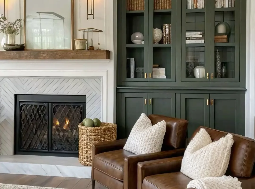
Picture this: it’s a grey Sunday afternoon, you’re curled into the corner of your sofa with a mug of something warm, and the light falls across a room that just feels calm. Not staged. Not shouty. Just layered, soft, and quietly expensive-looking. That feeling doesn’t come from a giant budget — it comes from a handful of design moves repeated well. Below you’ll find 18 timeless elegance living space ideas, each one a small, doable shift toward warmth and sophistication. Treat them like ingredients, not rules. Mix three or four, and your living room will start humming a different tune.
Advertisements1
Table of Contents(Click to Toggle)
- Why Timeless Elegance Living Spaces Are Worth Slowing Down For
- 18 Timeless Elegance Living Space Ideas
- 1. Start With a Warm Neutral Base
- 2. Layer Three Textures Minimum
- 3. Anchor the Room With a Wool or Jute Rug
- 4. Choose One Statement Cabinetry Moment
- 5. Add Natural Accents That Age Well
- 6. Use Linen Everywhere It Makes Sense
- 7. Build a Warm Lighting Plan
- 8. Hang Curtains High and Wide
- 9. Bring in One Vintage Wood Piece
- 10. Choose Art With Quiet Confidence
- 11. Add a Sculptural Ceramic or Vessel
- 12. Style Open Shelves Like a Still Life
- 13. Introduce a Soft, Muted Accent Colour
- 14. Mix Metals Instead of Matching Them
- 15. Make the Coffee Table Feel Collected
- 16. Add a Reading Chair With Presence
- 17. Use Greenery With Restraint
- 18. Finish With a Signature Scent and Sound
- Bonus Mentions
- The Timeless Room Is Never Really Finished
Why Timeless Elegance Living Spaces Are Worth Slowing Down For
Most rooms fail for the same reason a soup fails: too many ingredients added at once. Timeless elegance works the other way. It’s a slow simmer — neutral tones, layered textures, and a few design details that were already beautiful twenty years ago and will still be beautiful in twenty more. The payoff is practical, not just pretty. A room built on warm neutrals and natural materials is easier to update, easier to live in, and far less likely to feel dated after one trend cycle.
Think of it like a good coat. You don’t buy a new one every season; you buy one that fits, then change the scarf. That’s the whole philosophy here. Each idea below is a scarf — a small, affordable move you can make this weekend. None of them require a renovation. All of them compound.
18 Timeless Elegance Living Space Ideas
1. Farrow & Ball : Start With a Warm Neutral Base
What it is: A heritage paint brand known for complex, chalky, low-contrast neutrals like muted stone, soft taupe, and warm off-white.
Category: Paint and wall colour.
Why it stands out: Their neutrals carry a touch of grey or green rather than stark white, which is exactly what stops a room feeling cold. Ordering a few sample pots and painting large swatches on the wall lets you see how the colour shifts across morning and evening light before committing.
Best for: Anyone whose living room currently reads a little flat or clinical.
2. Zuiver : Layer Three Textures Minimum
What it is: A Dutch furniture and accessory brand with a strong line in boucle, velvet, wool, and matte finishes at mid-range prices.
Category: Furniture and soft furnishings.
Why it stands out: Their catalogue makes texture-mixing easy because the pieces are designed to sit together — a boucle chair next to a linen sofa next to a wool throw. The practical rule: aim for one smooth texture, one nubby one, and one that catches light.
Best for: Rooms that look good in photos but feel one-dimensional in person.
3. Rugs USA : Anchor the Room With a Wool or Jute Rug
What it is: A large-format rug retailer with thousands of options across wool, jute, and blended weaves.
Category: Flooring and rugs.
Why it stands out: A rug is the cheapest way to make a room feel designed. Go bigger than feels comfortable — at least the front legs of every major seat should sit on it. Jute adds earthy warmth; a low-pile wool adds quiet luxury. Their filters by material and size save a lot of scrolling.
Best for: Open-plan spaces that need a visual boundary without walls.
4. deVOL Kitchens : Choose One Statement Cabinetry Moment
What it is: A British kitchen and cabinetry maker whose hand-painted cupboards and dressers have become a shorthand for timeless English interiors.
Category: Built-in cabinetry and storage.
Why it stands out: Even if a full deVOL kitchen is out of reach, their archive is a free masterclass in proportion, colour, and hardware. Study how they pair deep greens and soft greys with brass cup handles, then replicate the look with a local joiner or a painted secondhand dresser.
Best for: Anyone adding built-in shelving or a media wall who wants it to feel permanent.
5. The Future Perfect : Add Natural Accents That Age Well
What it is: A design gallery and shop specialising in sculptural, material-forward pieces in stone, travertine, and solid wood.
Category: Accent furniture and objects.
Why it stands out: Natural materials develop patina rather than wear out, which is the whole point of timeless design. A travertine side table or a raw oak stool adds weight and honesty to a room full of soft textiles. Browse for inspiration even if you buy elsewhere.
Best for: Adding one grounding, slightly architectural object to a soft room.
6. Society Limonta : Use Linen Everywhere It Makes Sense
What it is: An Italian textile house producing stonewashed linen bedding, throws, and cushions in a muted, earthy palette.
Category: Textiles.
Why it stands out: Linen wrinkles, and that’s the feature, not the flaw. It reads relaxed rather than sloppy, and it softens hard edges in a room instantly. A linen throw over the arm of a structured sofa is one of the fastest elegance upgrades you can make.
Best for: Breaking up a room that feels too rigid or too new.
7. Pooky : Build a Warm Lighting Plan
What it is: A British lighting brand selling rechargeable, cordless table lamps and mix-and-match shades.
Category: Lighting.
Why it stands out: Elegance is mostly lighting. One overhead fixture flattens a room; three or four low, warm pools of light make it glow. Cordless lamps mean you can place light exactly where it’s needed — on a shelf, beside a chair, on a console — with no wiring at all.
Best for: Renters and anyone who can’t add new wall sockets.
8. The Curtain Company : Hang Curtains High and Wide
What it is: A made-to-measure curtain specialist offering linen, wool, and velvet in a wide range of neutral tones.
Category: Window treatments.
Why it stands out: Mount the rod as close to the ceiling as possible and extend it well past the window frame. The room instantly reads taller and more generous. Floor-length, generously full curtains in a warm neutral are one of the most reliable elegance signals in interior design.
Best for: Low-ceilinged or narrow rooms that need height and width.
9. Chairish : Bring in One Vintage Wood Piece
What it is: A curated online marketplace for vintage and antique furniture from dealers and estate sales.
Category: Vintage and antique furniture.
Why it stands out: One older piece stops a room looking like a showroom. A 1970s oak sideboard or a weathered console adds a story and a warmth that new flat-pack simply can’t. Search by material and era, and always check dimensions before you fall in love.
Best for: Adding character without adding clutter.
10. Eye For Design : Choose Art With Quiet Confidence
What it is: An online gallery offering original paintings, works on paper, and photography across a range of prices.
Category: Art and wall decor.
Why it stands out: Timeless rooms rarely shout through their art. A single large, muted abstract or a soft landscape does more than a gallery wall of busy prints. Buy the piece you’d still like in ten years, and hang it lower than you think — around eye level when seated.
Best for: Filling a large blank wall without visual noise.
11. Marimekko : Add a Sculptural Ceramic or Vessel
What it is: A Finnish design house long associated with bold, timeless ceramics, textiles, and home objects.
Category: Ceramics and decorative objects.
Why it stands out: A single well-proportioned vessel on a console or mantel gives the eye somewhere to rest. Matte glazes in clay, cream, or charcoal sit beautifully against neutral walls. Keep it empty or add two dried stems — restraint is the point.
Best for: Consoles, mantels, and empty corners that feel unresolved.
12. Garden Trading : Style Open Shelves Like a Still Life
What it is: A British homeware brand with a strong range of simple, well-made storage, baskets, and shelf accessories.
Category: Shelving and storage styling.
Why it stands out: Open shelves fail when they’re packed. Style them in triangles: one tall object, one stack of books, one small bowl, repeated along the shelf with breathing room between groups. Woven baskets hide the ugly stuff and add texture at the same time.
Best for: Alcoves and built-ins that currently look like storage, not design.
13. Little Greene : Introduce a Soft, Muted Accent Colour
What it is: A British paint company with a deep archive of historic colours, from dusty rose to muted sage.
Category: Paint and colour.
Why it stands out: Timeless doesn’t mean beige everywhere. One muted accent — a sage-green alcove, a clay-toned chimney breast — gives a neutral room a heartbeat. Their historic palette is specifically built to sit well with antiques and natural materials.
Best for: Adding depth to an all-neutral scheme without going bold.
14. Armac Martin : Mix Metals Instead of Matching Them
What it is: A British maker of solid brass hardware — handles, knobs, and pulls — in a range of aged finishes.
Category: Hardware and finishing details.
Why it stands out: Matching every metal in a room can look flat. Pairing aged brass with a brushed nickel or a blackened bronze adds depth, and hardware is the cheapest way to make cabinetry look bespoke. Solid brass also develops a living patina over time.
Best for: Upgrading standard cabinets, wardrobes, or a media unit.
15. Skandium : Make the Coffee Table Feel Collected
What it is: A Scandinavian design retailer stocking classic and contemporary home accessories.
Category: Styling and accessories.
Why it stands out: A coffee table styled in odd numbers — one large book, one small stack, one object, one candle — looks intentional rather than tidy. Vary heights and leave at least a third of the surface empty. It’s a two-minute change with an outsized effect.
Best for: Anyone whose coffee table is currently a dumping ground.
16. Made.com : Add a Reading Chair With Presence
What it is: A design-led furniture retailer known for statement chairs, sofas, and occasional pieces at accessible prices.
Category: Seating.
Why it stands out: Every timeless living room needs one chair that isn’t for the television — angled toward the window, with a side table and a lamp within reach. A chair with a visible silhouette, whether curved or wingback, gives the room a focal point and a reason to linger.
Best for: Creating a secondary conversation or reading zone.
17. Patch Plants : Use Greenery With Restraint
What it is: An online plant shop that matches plants to light levels and room conditions, with pots delivered to your door.
Category: Indoor plants.
Why it stands out: Timeless rooms use greenery as punctuation, not decoration. One large, architectural plant — a fiddle-leaf fig or an olive tree — in a simple clay or woven pot does more than six small ones scattered around. Their light-level filter prevents the classic mistake of buying a plant that dies in a dark corner.
Best for: Softening hard corners and adding life to neutral schemes.
18. Diptyque : Finish With a Signature Scent and Sound
What it is: A Parisian fragrance house known for its candles and home scents in understated glass vessels.
Category: Home fragrance and atmosphere.
Why it stands out: Elegance is multisensory. A single warm, woody candle and a low playlist turn a well-decorated room into an experience. Keep the vessel simple so it reads as part of the styling, not a label. This is the last five percent that people remember.
Best for: Evening entertaining and slow weekend mornings.
Bonus Mentions
House & Garden : Endless Timeless Interiors Inspiration
What it is: A long-running interiors magazine with a deep online archive of real homes.
Category: Inspiration and reference.
Why it stands out: Their house tours consistently show layered, warm, neutral-led rooms rather than trend-driven set pieces.
Best for: Weekend browsing when you need one good idea.
Remodelista : Source Lists and Material Guides
What it is: A design site focused on practical sourcing, materials, and understated interiors.
Category: Sourcing and guides.
Why it stands out: Their material guides explain why certain finishes age well, which helps you buy once rather than twice.
Best for: Planning a purchase you want to keep for a decade.
Etsy : Handmade and Vintage Accents
What it is: A global marketplace for handmade and vintage home goods.
Category: Marketplace.
Why it stands out: Ideal for one-of-a-kind ceramics, woven baskets, and framed vintage prints at every budget.
Best for: Finding the single object that makes a room feel personal.
IKEA : Affordable Classics Worth Hacking
What it is: The global flat-pack giant, with several pieces that have quietly become design staples.
Category: Budget furniture.
Why it stands out: Simple silhouettes plus upgraded hardware or a paint job can read far more expensive than they cost.
Best for: Filling a room now while you save for the forever piece.
1stDibs : Serious Antique and Designer Pieces
What it is: A high-end marketplace for antiques, vintage design, and collectible objects.
Category: Luxury vintage.
Why it stands out: The place to study provenance and proportion, even if you’re only window shopping for ideas.
Best for: Researching the one heirloom piece you’ll save for.
The Timeless Room Is Never Really Finished
Here’s the thing nobody tells you: a timeless living room isn’t the one you complete. It’s the one you keep tending. A new cushion here, a better lamp there, a plant that finally gets enough light. That’s not failure — that’s the whole pleasure of it. Treat your first attempt like a messy first draft. Move the chair. Repaint the swatch. Nothing is permanent, and nothing has to be perfect by Friday.
Start with the cheapest, highest-impact moves: warm the walls, layer three textures, and fix your lighting. Then let the rest arrive slowly, one considered piece at a time. Your future self — the one curled up on that grey Sunday — will thank you.
So here’s your challenge: pick just one idea from this list and do it this week. Then tell me in the comments which one you chose and what you discovered — I read every single one.
Keep your pen dancing.

Priya explores creative writing prompts and storytelling techniques for aspiring authors. She shares exercises to spark imagination and build narrative confidence, drawn from her own writing practice.


