

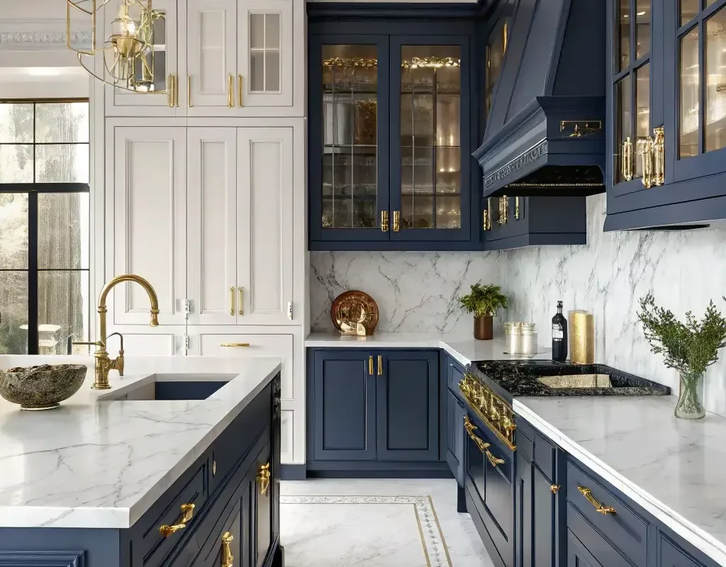
Imagine your kitchen as a canvas, and the cabinets as the bold strokes that set the entire mood. Whether you’re dreaming of a serene sanctuary or a dramatic statement, the color of your cabinets is the heartbeat of the room. I remember when I first painted my own cabinets a deep, moody green—it felt like the whole house sighed with contentment. There’s a certain magic in choosing a hue that reflects your personality, and with so many modern options, you can truly make your kitchen sing. So, are you ready to explore a palette that will transform your space from ordinary to extraordinary? Let’s dive into a world of color that promises a fresh start.
Advertisements1
Table of Contents(Click to Toggle)
- Why Your Cabinet Color Choice Matters
- 1. Royal Navy Prestige
- 2. Sage Green Serenity
- 3. Charcoal Drama
- 4. Classic White Brightness
- 5. Warm Greige Elegance
- 6. Forest Green Richness
- 7. Terracotta Warmth
- 8. Soft Blue Tranquility
- 9. Black Matte Sophistication
- 10. Warm Oak Naturalness
- 11. Dusty Rose Romance
- 12. Creamy Ivory Softness
- 13. Slate Blue Depth
- 14. Mint Green Freshness
- 15. Two-Tone Playfulness
- Bonus Mentions
Why Your Cabinet Color Choice Matters
Your kitchen cabinets are more than just storage—they’re the visual anchor of your home. They occupy a significant portion of your walls and set the tone for your entire aesthetic. Choosing the right color can make a small kitchen feel expansive, a dark room feel brighter, and a dated space feel contemporary. It’s a decision that blends art and psychology, affecting how you feel every time you walk in. The colors you select can evoke warmth, calm, or even energy, so it’s worth taking the time to explore the vast possibilities. With the right shade, you can create a kitchen that’s not only functional but also a true reflection of your style.
1. Royal Navy Prestige : Regal Blue Sophistication
What it is: A deep, rich navy blue that adds a sense of luxury and depth to any kitchen.
Category: Color Inspiration
Why it stands out:
- Pairs beautifully with gold or brass hardware for an elegant, timeless look.
- Contrasts strikingly with white or marble countertops, making the space feel crisp and refined.
- Works well in both traditional and modern settings, offering versatility.
Best for: Homeowners who want to make a bold yet sophisticated statement without overwhelming the senses.
2. Sage Green Serenity : Calming Natural Vibe
What it is: A muted, earthy green that brings a sense of calm and organic warmth to the kitchen.
Category: Color Inspiration
Why it stands out:
- Creates a soothing atmosphere, perfect for a busy family hub.
- Complements wooden countertops and brass fixtures, enhancing a farmhouse or cottage feel.
- Easy to pair with neutral tones, allowing for flexible decor changes.
Best for: Those who love nature-inspired interiors and want a kitchen that feels like a breath of fresh air.
3. Charcoal Drama : Modern Moody Edge
What it is: A dark gray with a hint of warmth, almost black, that adds instant drama and sophistication.
Category: Color Inspiration
Why it stands out:
- Provides a stunning backdrop for metallic fixtures, making them pop.
- Hides stains and fingerprints better than lighter shades, ideal for busy kitchens.
- Creates a sleek, contemporary look when paired with concrete or wood elements.
Best for: Modern lofts or urban kitchens where a bold, edgy aesthetic is desired.
4. Classic White Brightness : Timeless Clean Appeal
What it is: The quintessential white cabinet, available in various shades from pure to off-white.
Category: Color Inspiration
Why it stands out:
- Reflects light, making small or dark kitchens appear larger and brighter.
- Offers a clean, crisp backdrop that suits any style, from traditional to minimalist.
- Easily updated with different hardware and decor, providing endless versatility.
Best for: Those who want a safe yet beautiful choice that never goes out of style.
5. Warm Greige Elegance : Subtle Sophistication
What it is: A blend of gray and beige, creating a warm neutral that’s more interesting than plain beige.
Category: Color Inspiration
Why it stands out:
- Adds warmth without the yellow undertones of traditional beige.
- Pairs harmoniously with both cool and warm accent colors.
- Creates a cozy, inviting atmosphere that feels both modern and timeless.
Best for: Homeowners seeking a neutral that offers more depth and versatility than standard whites or grays.
6. Forest Green Richness : Deep Connection to Nature
What it is: A deep, saturated green reminiscent of a lush forest, bringing the outdoors in.
Category: Color Inspiration
Why it stands out:
- Creates a luxurious, cozy atmosphere, especially in larger kitchens.
- Works beautifully with brass, copper, and wood tones for a natural, grounded feel.
- Makes a bold statement while still feeling organic and calming.
Best for: Nature lovers who want to make a dramatic, earthy impact in their kitchen.
7. Terracotta Warmth : Earthy Mediterranean Charm
What it is: A warm, clay-like orange-brown that brings a cozy, sun-baked feel to the kitchen.
Category: Color Inspiration
Why it stands out:
- Infuses the space with warmth and a sense of history, perfect for rustic or eclectic styles.
- Pairs well with cream, olive, and navy accents for a rich palette.
- Adds a unique pop of color that’s not overpowering.
Best for: Those who love Mediterranean or Southwestern aesthetics and want a kitchen with character.
8. Soft Blue Tranquility : Airy Coastal Calm
What it is: A light, airy blue that evokes feelings of calm and serenity, reminiscent of a clear sky.
Category: Color Inspiration
Why it stands out:
- Brightens up the kitchen while adding a subtle touch of color.
- Pairs beautifully with white, gray, and natural wood tones.
- Perfect for creating a coastal or farmhouse vibe.
Best for: Homeowners who want a soothing, fresh look that’s not too bold.
9. Black Matte Sophistication : Sleek Modern Luxury
What it is: A matte black finish that exudes contemporary elegance and a touch of drama.
Category: Color Inspiration
Why it stands out:
- Creates a high-contrast, striking look that is both chic and timeless.
- Hides dirt and wear well, making it practical for daily use.
- Pairs stunningly with white countertops and gold or brass fixtures.
Best for: Modern, minimalist kitchens that want to make a bold design statement.
10. Warm Oak Naturalness : Embracing Wood Grain
What it is: A return to natural wood finishes, with oak being the star, showcasing its beautiful grain.
Category: Color Inspiration
Why it stands out:
- Adds warmth and texture that painted cabinets can’t replicate.
- Creates a connection to nature and a sense of authenticity.
- Works well in rustic, Scandinavian, or transitional styles.
Best for: Those who appreciate the beauty of natural materials and want a warm, inviting kitchen.
11. Dusty Rose Romance : Soft Feminine Charm
What it is: A muted pink with a hint of gray, creating a romantic yet sophisticated look.
Category: Color Inspiration
Why it stands out:
- Adds a subtle pop of color that’s both trendy and timeless.
- Pairs beautifully with white, gray, and brass accents.
- Creates a warm, inviting atmosphere that’s not overly feminine.
Best for: Homeowners who want a unique, soft color that’s unexpected and charming.
12. Creamy Ivory Softness : Warm White Alternative
What it is: A warm, creamy off-white that offers the brightness of white without the starkness.
Category: Color Inspiration
Why it stands out:
- Adds warmth to the kitchen, making it feel cozy and inviting.
- Pairs well with a variety of accent colors and materials.
- Creates a soft, elegant look that’s less sterile than pure white.
Best for: Those who love white cabinets but want a softer, more welcoming feel.
13. Slate Blue Depth : Moody Yet Soothing
What it is: A mid-tone blue-gray that brings depth and sophistication to the kitchen.
Category: Color Inspiration
Why it stands out:
- Strikes a balance between cool and warm tones, making it versatile.
- Adds a touch of drama without being too dark.
- Pairs well with white, brass, and natural wood for a cohesive look.
Best for: Homeowners looking for a color that’s both calming and full of character.
14. Mint Green Freshness : Retro Playful Energy
What it is: A light, minty green that brings a fresh, vintage-inspired vibe to the kitchen.
Category: Color Inspiration
Why it stands out:
- Adds a pop of color that feels cheerful and energetic.
- Pairs well with white, chrome, and pastel accents for a retro look.
- Brightens up the space while maintaining a soothing quality.
Best for: Those who love a playful, retro aesthetic and want a kitchen that feels fun and inviting.
15. Two-Tone Playfulness : Mixing Colors Creatively
What it is: A design trend where upper and lower cabinets are painted in different colors, often light on top and dark below.
Category: Design Technique
Why it stands out:
- Adds visual interest and depth, breaking up large expanses of cabinetry.
- Allows you to experiment with bold colors without overwhelming the space.
- Can make a kitchen feel more custom and designer-crafted.
Best for: Creative homeowners who want to make a unique statement and add dimension.
Bonus Mentions
Instagram Inspiration : Real-Life Color Ideas
Browse hashtags like #kitchencabinetcolor or #kitchenremodel for endless real-life examples and see how different colors look in actual homes.
Houzz : Professional Advice
Find expert tips, photos, and forums where you can ask questions and get feedback on your color choices from design professionals.
Pinterest Boards : Curated Color Palettes
Create your own board or explore existing ones to gather a collection of kitchen color schemes that speak to you.
Architectural Digest : High-End Inspirations
See how top designers use color in luxury kitchens, offering a glimpse into the latest trends and classic combinations.
The Palette of Possibilities Awaits
Choosing the right color for your kitchen cabinets is an exciting journey that can transform the heart of your home. Whether you’re drawn to the regal depth of navy, the calming aura of sage, or the playful energy of mint, there’s a shade that perfectly captures your essence. Remember, your kitchen should be a reflection of your personality—a space where you love to cook, gather, and create memories. So, which of these colors makes your heart skip a beat? Have you tried any of these in your own kitchen? Share your favorite cabinet color or a unique shade you’ve discovered on your own—I’d love to hear about it! Write boldly, dream wildly.

Amara explores creative writing and storytelling, with a focus on finding your unique voice and building compelling narratives. She shares prompts and exercises to spark imagination, drawing on her love of folklore and modern fiction.


