

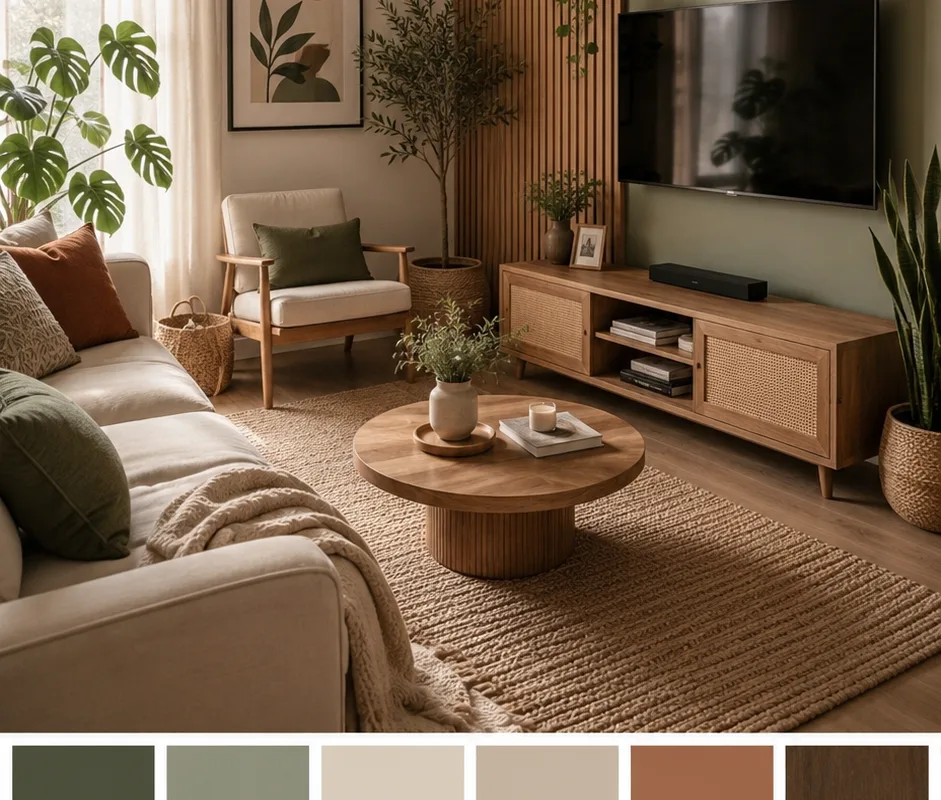
Most “boho” living rooms you see online are just beige rooms with a rattan basket in the corner and a caption about vibes. That’s not a design system — that’s a shopping list. Earth tone interior design actually works when you treat color, texture, and light as three separate variables you control, not one mood you hope for. Think of it like mixing a song: sage green is your bassline, terracotta is the melody, and natural wood is the rhythm holding it all together. Get the ratio wrong and it sounds like noise. Below are 15 real sources — retailers, color tools, texture suppliers, and free planning resources — that let you build a cozy boho living room that holds up in daylight, not just in a filtered photo.
Advertisements1
Table of Contents(Click to Toggle)
Why Earth Tone Palettes Beat Trend Colors
Here’s the uncomfortable truth about interior trends: the colors that photograph best are usually the ones that age worst. Millennial grey had a five-year run and now reads as “rental flip.” Neon accent walls were a 2021 TikTok artifact. Earth tones — sage, terracotta, clay, ochre, warm walnut — survive because they’re borrowed from materials that already exist in nature, and nature doesn’t do trend cycles.
There’s a practical reason too. Earth tones have lower saturation, which means they reflect less harsh light and hide imperfections better than pure white or saturated jewel tones. In a living room — the room where you actually sit and exist — that translates to less visual fatigue and more perceived warmth. The catch is that “earthy” is not a license to buy everything in beige. A room needs contrast anchors: a dark wood tone, one deeper saturated accent, and a texture that breaks the flatness. The 15 resources below cover every one of those jobs, from picking the exact sage to sourcing the rug that ties it together.
15 Earth Tone Interior Design Resources for a Cozy Boho Living Room
1. Benjamin Moore : The paint library that anchors your whole palette
What it is: A premium paint brand with one of the most extensive curated color collections in the industry, plus a free online color gallery.
Category: Paint & Color Reference
Why it stands out: Their historical and “Color Preview” collections include genuinely usable earth tones like soft sage, warm greige, and muted clay that don’t turn neon under warm bulbs. The website lets you filter by color family and see suggested coordinating shades — useful when you’re trying to match a terracotta accent wall to a sofa you already own.
Best for: Anyone picking the base wall color before buying a single piece of furniture.
2. Farrow & Ball : Deep, chalky pigments built for organic modern rooms
What it is: A British paint company known for complex, low-chroma pigments mixed with high mineral content.
Category: Paint & Color Reference
Why it stands out: Their finishes have a matte, chalky depth that flatters natural wood and linen in a way standard vinyl-matte paint doesn’t. Shades like greenish stone and muted olive are the exact tones that make a boho living room feel collected rather than decorated. The trade-off is price and limited US availability — worth it for one accent wall, less so for a whole house on a budget.
Best for: A single statement wall behind the sofa or a fireplace surround.
3. Sherwin-Williams ColorSnap Visualizer : Test colors on your own wall before you commit
What it is: A free tool that lets you upload a photo of your room and paint the walls digitally in real Sherwin-Williams shades.
Category: Color Visualization Tool
Why it stands out: Most people pick earth tones off a screen and are shocked when they dry warmer or darker. ColorSnap applies the actual product color to your actual lighting conditions, which is the single biggest variable in how sage green reads. You can also order peel-and-stick samples if you want to confirm in person.
Best for: Renters and homeowners who can’t afford to repaint a mistake.
4. Behr ColorSmart : Budget-friendly color matching with real-world previews
What it is: Behr’s free color selection and visualization platform, tied to paint sold at Home Depot.
Category: Color Visualization Tool
Why it stands out: It’s the pragmatic option. You get coordinated palette suggestions, photo upload previews, and the ability to walk into a store the same day and buy the exact can. For a boho living room where you’re layering many tones, being able to iterate cheaply matters more than prestige branding.
Best for: DIY painters doing a full room on a realistic budget.
5. Coolors : Build a five-color earth palette in under two minutes
What it is: A fast, free palette generator that started as a designer tool and now works for anyone.
Category: Palette Planning Tool
Why it stands out: You can lock a sage green you love, then let it generate complementary terracotta and neutral tones that actually harmonize. It also exports hex codes, which is genuinely useful when you’re trying to match a rug to a cushion to a paint chip across three different stores. The free tier is enough for interior planning.
Best for: People who want a documented palette instead of guessing at the store.
6. Adobe Color : Extract a palette from a photo of a room you love
What it is: Adobe’s free color wheel and palette extraction tool.
Category: Palette Planning Tool
Why it stands out: The “Extract Theme” feature pulls a working palette straight out of any image — a saved Pinterest photo, a photo of your own room, a landscape. That’s how you reverse-engineer why a specific boho living room works: you see the actual ratio of warm to cool tones rather than eyeballing it. It also shows harmony rules, so you learn the logic instead of copying one room.
Best for: Anyone who keeps saving inspiration photos but can’t articulate why they like them.
7. Rugs Direct : The texture layer that makes earth tones feel warm
What it is: A large online rug retailer with strong filtering by material, color, and size.
Category: Rugs & Textiles
Why it stands out: Flat color palettes feel cold without texture, and a rug is the cheapest way to add it at scale. Their filters let you narrow to jute, wool, and viscose in specific earth tones, and the size guide is genuinely helpful — most people buy a living room rug two sizes too small, which visually shrinks the whole room. Free returns on many items reduce the risk of a big-ticket miss.
Best for: Anchoring a seating area without committing to new furniture.
8. Loloi Rugs : Designer-grade patterns in muted, wearable tones
What it is: A rug brand that supplies both designers and direct-to-consumer buyers.
Category: Rugs & Textiles
Why it stands out: Loloi is where you find the faded, vintage-washed look that defines modern boho without buying an actual antique. Their earth tone options tend to be multi-tonal rather than flat, which hides footprints and pet hair far better than a solid cream rug. Worth knowing: their popular collections sell out and restock slowly, so check availability before you build a room around one.
Best for: High-traffic living rooms that need to look good while being lived in.
9. Article : Mid-century wood furniture without the showroom markup
What it is: A direct-to-consumer furniture retailer focused on clean, warm-toned modern pieces.
Category: Furniture
Why it stands out: Natural wood is the structural element of any earth tone room, and Article’s walnut and oak finishes are consistently warmer than the grey-washed wood that dominates big-box stores. Because they sell direct, pricing on solid-wood pieces is noticeably lower than comparable showroom brands. Delivery is curbside or in-home depending on the item, so factor that into the plan.
Best for: Buying the one or two wood anchor pieces the rest of the room hangs on.
10. Article’s Sven Sofa Line : The leather anchor that keeps beige from going flat
What it is: Article’s signature leather and fabric sofa collection, available in multiple sizes and finishes.
Category: Furniture
Why it stands out: A tan or cognac leather sofa is the single fastest way to add a saturated earth tone to a room that’s drifting toward beige soup. Leather also ages visibly, which is the opposite of a problem in this style — it develops patina instead of looking worn out. The fabric versions in warm grey and oatmeal work if leather isn’t practical for pets or kids.
Best for: A living room that needs one strong, warm focal point.
11. West Elm : Ethical-sourcing labels and organic textiles in earth tones
What it is: A home retailer with a substantial range of organic cotton, linen, and responsibly sourced wood products.
Category: Furniture & Textiles
Why it stands out: They label materials clearly — organic cotton, FSC-certified wood, recycled glass — which matters if your boho aesthetic is tied to a lower-impact mindset, not just a look. Their curtain and throw selections in clay, oatmeal, and olive are reliably on-palette. Sales cycle frequently, so list prices aren’t always the real price.
Best for: Layering soft goods — curtains, throws, cushions — in coordinated tones.
12. Terrain : Plant-forward styling that completes the organic look
What it is: A garden-and-home retailer from the Anthropologie family, focused on plants, pottery, and natural materials.
Category: Decor & Plants
Why it stands out: Earth tone rooms need living green to stop feeling like a sepia photograph. Terrain sells the plants, the terracotta and stoneware pots, and the dried stems that make a corner read as intentional rather than empty. Their pottery glazes are muted and organic, not glossy — which is exactly the texture that pairs with sage and clay walls.
Best for: The final 10% of styling that makes a room look finished.
13. Etsy : Handmade textures you won’t find in a chain store
What it is: A global marketplace for handmade and vintage goods.
Category: Marketplace
Why it stands out: This is where you find the specific things that make a boho room feel personal: handwoven wall hangings, macrame, mudcloth cushions, one-off ceramics, and vintage brass. Search by material and color rather than by trend keyword, and you’ll get far better results. Be aware that processing times vary wildly between sellers — order decor six to eight weeks before you need it.
Best for: One-of-a-kind accents that break up a room full of mass-produced pieces.
14. Pinterest : Reverse-engineer the palettes you keep saving
What it is: A visual discovery platform that functions as a free mood-board tool.
Category: Inspiration & Planning
Why it stands out: The trick most people miss: stop saving whole rooms and start saving swatches. Build a board of only color, texture, and material close-ups, and patterns emerge fast — you’ll notice you keep gravitating to the same three tones. Pinterest’s visual search also lets you crop a single element from a photo and find similar items, which is genuinely useful for tracking down a specific lamp or rug.
Best for: Turning vague “I like earthy things” into a defined, repeatable palette.
15. Houzz : See earth tone rooms with the lighting conditions labeled
What it is: A home design platform with a massive photo database and a directory of local professionals.
Category: Inspiration & Planning
Why it stands out: Houzz photos are tagged by style, color, and room, so you can filter specifically for earthy and organic-modern living rooms and skip the noise. More importantly, many listings note whether the space is north-facing or south-facing — the detail that explains why the same sage green looks grey in one house and olive in another. If you’re hiring help, the pro directory includes reviews and project photos.
Best for: Understanding how natural light will change your chosen palette.
Bonus Mentions
IKEA : Affordable natural-fiber and wood basics
Their jute rugs, rattan lighting, and pine and birch pieces are the cheapest legitimate entry point into this style. Check the material label — solid wood lines hold up far better than the foil finishes.
Anthropologie Home : Statement textiles with real texture
Where to go when you want one dramatic, tactile piece — a chunky throw, an embroidered cushion, a carved wood mirror. Prices are high, but sales are frequent and steep.
Target : Fast, low-risk palette experiments
Their Threshold and Studio McGee lines reliably carry muted earth tones at prices that make testing a color scheme painless. Good for cushions, vases, and small decor you might swap in a year.
Wayfair : Broad filtering across every budget tier
The filters are genuinely powerful — narrow by color family, material, and price at once. Quality varies enormously between sellers, so read the material specs rather than trusting the photos.
Where to Start Tomorrow Morning
Here’s the honest version: you don’t need fifteen resources. You need three decisions made in the right order. First, lock the wall color using a visualizer on your actual walls — not on a screen in a store. Second, choose one saturated earth tone as your anchor, whether that’s a leather sofa, a terracotta rug, or a deep olive accent wall. Third, add texture until the room stops looking flat, which usually means one natural-fiber rug and two or three handmade pieces.
Everything else is noise. The reason most earth tone rooms fail isn’t a lack of shopping — it’s that people buy all three layers at once from the same store, and the result looks like a catalog page instead of a home. Buy the paint first. Live with it for a week. Then add wood. Then add texture. The room will tell you what it needs.
One warning worth repeating: any tool that promises to “perfectly match” a color from a phone photo is guessing. Phone cameras auto-white-balance aggressively, and screens vary. Use digital tools to narrow the field, then order a physical sample before you spend real money. That one habit saves more regret than any app.
What’s the one earth tone you keep coming back to no matter how many palettes you try — and did it actually work in your space? Drop it in the comments.
Stay sharp, stay private.

Lucas covers technology and digital privacy, explaining complex topics in plain language for non-techies. He focuses on how everyday people can protect their data without being paranoid.


