

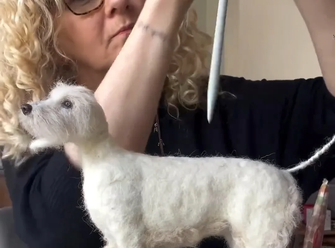
Ever wonder how artists create those breathtaking creative artworks? I'm Elena Vasquez, and I've spent years in the studio—let me share my best tips to help you make art you're proud of. You'll get concrete, do-this-not-that advice that actually works.
Advertisements1
- A clean, organized workspace and good lighting are non-negotiable for consistent results.
- Master your medium's unique properties—like acrylics' fast drying time or oils' fat-over-lean rule.
- Composition trumps color: use the rule of thirds and value contrast to guide the viewer's eye.
- A limited split-primary palette yields vibrant, harmonious colors and prevents mud.
- Varnishing and signing your work add a professional finish and protect your investment.
- Creative blocks are temporary—switch mediums, set constraints, or step away to overcome them.
Set Up Your Space for Success
Before you dive into your next masterpiece, take 10 minutes to prep your workspace. A cluttered area leads to cluttered thinking—trust me, I've been there. Clear your table, organize your supplies, and ensure good lighting. Natural light is ideal, but a daylight-balanced lamp works wonders. This prep time is like preheating an oven: it sets the stage for consistent results.
Gather only the materials you need for the current project. If you're painting, have your brushes, palette, and canvas ready. If you're drawing, sharpen your pencils and have your erasers handy. This minimizes interruptions and keeps your creative flow uninterrupted.
Consider investing in a comfortable chair and an easel that adjusts to your height. Your posture affects your stroke control and stamina. I learned this the hard way after a marathon session left me with a sore back—now I never skip ergonomics.
Master Your Medium: Techniques That Make a Difference
Every medium has its quirks. For acrylics, keep a spray bottle handy to mist your palette—acrylics dry fast, and you want them workable. For oils, remember 'fat over lean': start with thin layers and build up. This prevents cracking over time. Watercolors? Embrace their unpredictability; use wet-on-wet for soft blends and wet-on-dry for crisp edges.
Practice specific techniques like scumbling (dragging a dry brush over textured surface) or glazing (applying transparent layers). These add depth and sophistication to your work. I spend 15 minutes each morning doing warm-up exercises: quick sketches, color swatches, or brushstroke drills. It's like stretching before a run—it primes your muscle memory.
Don't be afraid to experiment. Try mixing media: pastels over watercolor, or ink with acrylic. Some of my best pieces came from happy accidents when I stepped outside my comfort zone.
Composition Secrets: Arrange Elements Like a Pro
The rule of thirds is your friend, but don't be a slave to it. Divide your canvas into a 3×3 grid and place key elements along the lines or at intersections. This creates balance and interest. For dynamic scenes, use diagonals to lead the eye. Think of it as directing traffic—you want viewers to wander, not get stuck.
Value contrast is more important than color. Squint at your work: if the values blur together, your composition lacks punch. I often do a quick thumbnail sketch in grayscale before committing to color. It saves hours of rework.
Negative space isn't wasted space—it gives your subject room to breathe. In my portrait work, I leave at least 30% of the canvas empty to avoid clutter. This is especially crucial for Pinterest-friendly art that needs to read well at small sizes.
Color Confidence: Mixing and Matching Like a Boss
Start with a limited palette: one red, one blue, one yellow, plus white and burnt umber. You can mix almost any color from these. This approach forces you to understand color relationships. I use a split-primary palette: cool and warm versions of each primary. It gives me vibrant secondary colors without mud.
When mixing, add dark to light, not the other way around. A tiny bit of dark pigment goes a long way. For skin tones, avoid straight peach—mix complementary colors to neutralize. A touch of green or purple can make flesh look alive.
Keep a color journal. Swatch your mixes and label them. Over time, you'll build a personal library of go-to combinations. And remember: color is emotional. Warm colors advance, cool colors recede. Use this to create depth.
The Finishing Touches: Varnishing, Signing, and Presenting
Once your artwork is dry (check the label—oils can take weeks), it's time to varnish. Varnish protects against UV and dust, and it unifies the surface sheen. Use a soft brush and apply thin coats in a crisscross pattern. Let each coat dry completely. I prefer removable varnish so future conservation is possible.
Sign your work in a consistent spot—usually bottom right. Use a color that's visible but not distracting. A small signature in a neutral tone works best. If you're selling, include a certificate of authenticity with details like title, medium, dimensions, and date.
For photographing your art, use diffused daylight and a polarizing filter to reduce glare. Shoot straight on, and include a detail shot. These images are your portfolio—they need to shine on social media and gallery submissions.
Overcoming Creative Blocks: Practical Strategies
Creative block is normal—even for pros. When it hits, I switch mediums or do a 5-minute continuous line drawing. The goal is to silence your inner critic. Another trick: set a timer for 20 minutes and paint something ugly. Permission to be bad often leads to breakthroughs.
Keep an inspiration file. Mine is full of color palettes, textures, and compositions I admire. When stuck, I flip through it and combine two ideas. Constraints breed creativity: limit yourself to three colors or one brush. You'll be surprised how inventive you become.
Finally, step away. A walk, a shower, or a good night's sleep can solve what hours at the easel couldn't. Your brain continues working subconsciously. Trust the process.
How to Do It, Step by Step
- 1Prep Your Workspace
Clear your area, organize supplies, and ensure good lighting. This reduces distractions and sets a productive tone. - 2Warm Up with Exercises
Spend 15 minutes on quick sketches or brushstroke drills to activate muscle memory and focus. - 3Plan Your Composition
Do a thumbnail sketch in grayscale to establish values and layout before committing to color. - 4Mix Colors with a Limited Palette
Use a split-primary palette to mix vibrant colors and avoid muddy results. - 5Work in Layers
Build up your painting gradually, following fat-over-lean for oils and thin-to-thick for acrylics. - 6Take Breaks and Step Back
Periodically view your work from a distance to spot issues and maintain perspective. - 7Finish with Varnish and Sign
Protect your artwork with varnish and sign it consistently for a professional touch. - 8Photograph Your Art
Use diffused daylight and a polarizing filter to capture true colors and details for your portfolio.
The difference between a good painting and a great one often comes down to the artist's willingness to experiment and learn from mistakes.
Frequently Asked Questions
What are the best tips for creating creative artworks?
Start with a clean workspace, warm up with exercises, plan your composition, use a limited palette, and work in layers. These habits build a strong foundation for any artwork.
How do I overcome artist's block?
Try switching mediums, setting a timer for a quick ugly painting, or stepping away for a walk. Often, giving yourself permission to create without pressure unlocks new ideas.
What is the fat over lean rule in oil painting?
Fat over lean means applying paint with more oil (fat) over layers with less oil (lean). This prevents cracking because flexible layers go over rigid ones.
How should I photograph my artwork?
Use diffused daylight, shoot straight on, and use a polarizing filter to reduce glare. Include detail shots to showcase texture and brushwork.
Do I need to varnish my painting?
Yes, varnishing protects against UV and dust, and it unifies the surface sheen. Use a removable varnish and apply thin coats in a crisscross pattern.

Elena focuses on healthy cooking and meal prep for people with limited time and budget. She shares flexible recipes and shortcuts that don’t sacrifice flavor.


