

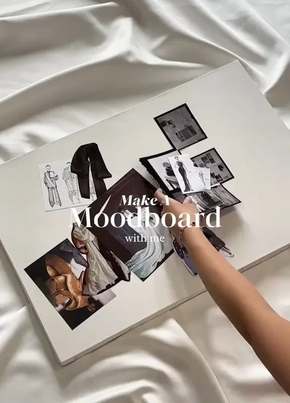
A mood board is not just a collage; it's a visual compass for your teen's space. By gathering textures, colors, and light, you can turn a fleeting vibe into a room that feels like home. Let's explore how to curate a board that's both trendy and timeless.
Advertisements1
- Start with a sensory anchor to keep the board personal and cohesive.
- Use the 60-30-10 rule to balance dominant, secondary, and accent colors.
- Layer textures to add depth and tactile appeal.
- Incorporate lighting references to plan for mood throughout the day.
- Print and physically arrange your board to see true color interactions.
- Translate the board into a phased shopping list to avoid overwhelm.
Start with a Single Sensory Anchor
Before you pin a single image, ask your teen to close their eyes and recall a place where they felt completely at ease. It might be a sunlit corner of a café, the worn leather of a grandparent's armchair, or the hush of a library after rain. That memory holds the palette and mood you're after.
From there, choose one anchor object—a paint chip, a fabric swatch, a postcard—that captures that feeling. I once watched a fifteen-year-old choose a faded denim jacket as her anchor. Its indigo and silver buttons became the room's spine: walls in soft chambray, hardware in brushed nickel, a throw in washed linen.
Why it works: A single anchor prevents the board from becoming a chaotic wish list. It gives every later choice a filter. The common mistake? Skipping this step and diving straight into trends, which leads to a room that feels borrowed rather than personal.
Build a Palette with the 60-30-10 Rule
Interior designers often use a 60-30-10 ratio: 60% dominant color, 30% secondary, 10% accent. For teens, this translates to walls and large furniture in the dominant hue, bedding and curtains in the secondary, and accents in the boldest shade. A current trend like 'digital lavender' works beautifully as an accent against warm greige walls.
Gather paint chips from a hardware store—free and plentiful. Arrange them on a neutral surface. Squint. If one color jumps out too aggressively, it's likely an accent, not a dominant. I keep a stack of chips in a drawer; they're like a deck of cards for mood.
Why it works: The ratio creates visual balance without monotony. Mistake to avoid: making the accent color 30% instead of 10%, which can overwhelm the space and make it feel smaller.
Layer Textures for Depth
Color alone can feel flat. Texture adds the tactile quality that makes a room inviting. Encourage your teen to collect swatches of chunky knit, velvet, rattan, and matte ceramic. A board with a mix of smooth and rough, shiny and dull, will translate into a room that begs to be touched.
For a recent project, we paired a bouclé chair with a jute rug and a glass lamp. The interplay of light on these surfaces created a gentle rhythm. When pinning, include close-up photos of textures; they remind you of the feel, not just the look.
Why it works: Texture engages the senses beyond sight, making the space feel layered and lived-in. Common mistake: choosing only smooth, shiny materials, which can make a room feel cold and clinical.
Incorporate Lighting as a Design Element
Light changes everything. A color that looks muddy in dim light can glow near a window. On your mood board, add images that show how light falls—sunlight streaming through sheer curtains, the warm pool of a salt lamp, the cool glow of fairy lights. These are not just decor; they are mood makers.
I often suggest a simple test: hold a fabric swatch near a window at different times of day. Notice how it shifts. For teens, adjustable lighting like dimmable LEDs or a smart bulb can transform a room from study to hangout in seconds.
Why it works: Lighting sets the emotional temperature of a space. Mistake to avoid: ignoring artificial light sources when planning, leading to a room that only feels right during the day.
Curate with a Digital Tool, Then Print
Pinterest and Canva are great for gathering, but the real magic happens when you print and arrange. A physical board lets you see colors side by side without screen glare. Use a foam core board and washi tape—no glue, so you can rearrange.
I watched a teen move a single swatch of terracotta from the corner to the center, and suddenly the whole board sang. That tactile editing is impossible on a screen. Print images at 2×2 inches for a mosaic effect.
Why it works: Physical arrangement reveals relationships that digital scrolling hides. Mistake: leaving it digital, where colors can appear more saturated than in reality.
Translate the Board into a Shopping List
A mood board without action is just art. Break it down into categories: paint, furniture, textiles, lighting, accessories. For each, note specific items and budget-friendly alternatives. For example, a $200 velvet headboard can be substituted with a $30 velvet pillow cover set.
I keep a running list on my phone, organized by room zone. When a teen falls in love with a $500 lamp, we find a similar silhouette at a thrift store and spray-paint it. The board guides, but the budget rules.
Why it works: It turns inspiration into a plan, reducing impulse buys. Mistake: buying everything at once; instead, phase it over three months to allow the room to evolve.
The Hacks, Step by Step
- 1Gather 15-20 images that evoke a feeling
Use Pinterest or magazines. Don't overthink; save anything that sparks a sensory memory. This builds your raw material. - 2Select one anchor object or color
Choose a single item that embodies the mood. It will be your north star for all decisions. - 3Apply the 60-30-10 color rule
Pick a dominant, secondary, and accent color. Use paint chips to test the ratio. This ensures balance. - 4Add at least three textures
Include swatches of rough, smooth, and shiny materials. Texture prevents flatness. - 5Include lighting references
Pin images showing different light qualities—natural, warm, cool. Lighting sets the mood. - 6Print and arrange on a physical board
Use washi tape for easy rearranging. Physical editing reveals true color relationships. - 7Create a categorized shopping list
List items by zone and budget. Find alternatives for expensive pieces. This makes it actionable.
A mood board is not a collage of trends; it is a portrait of a feeling you want to live inside.
Frequently Asked Questions
What is a mood board for a teen bedroom?
A mood board is a visual tool that collects colors, textures, and images to define the style of a room. It helps teens make cohesive design choices before buying anything.
How do I choose trendy colors for a teen room?
Start with one anchor color that resonates with your teen, then build a palette using the 60-30-10 rule. Trends like digital lavender or earthy terracotta can be accents or dominants depending on preference.
What are some popular decor themes for teens in 2025?
Popular themes include 'japandi' (Japanese-Scandinavian minimalism), 'dopamine decor' with bright pops of color, and 'cottagecore' with vintage florals and natural textures. The key is to adapt them to personal taste.
Can I make a mood board without spending money?
Yes. Use free paint chips from hardware stores, print images at home, and gather fabric swatches from old clothes. Digital tools like Canva are also free and effective.
How do I turn a mood board into an actual room design?
After finalizing the board, create a shopping list categorized by paint, furniture, textiles, lighting, and accessories. Set a budget and phase purchases over time to avoid overwhelm.


