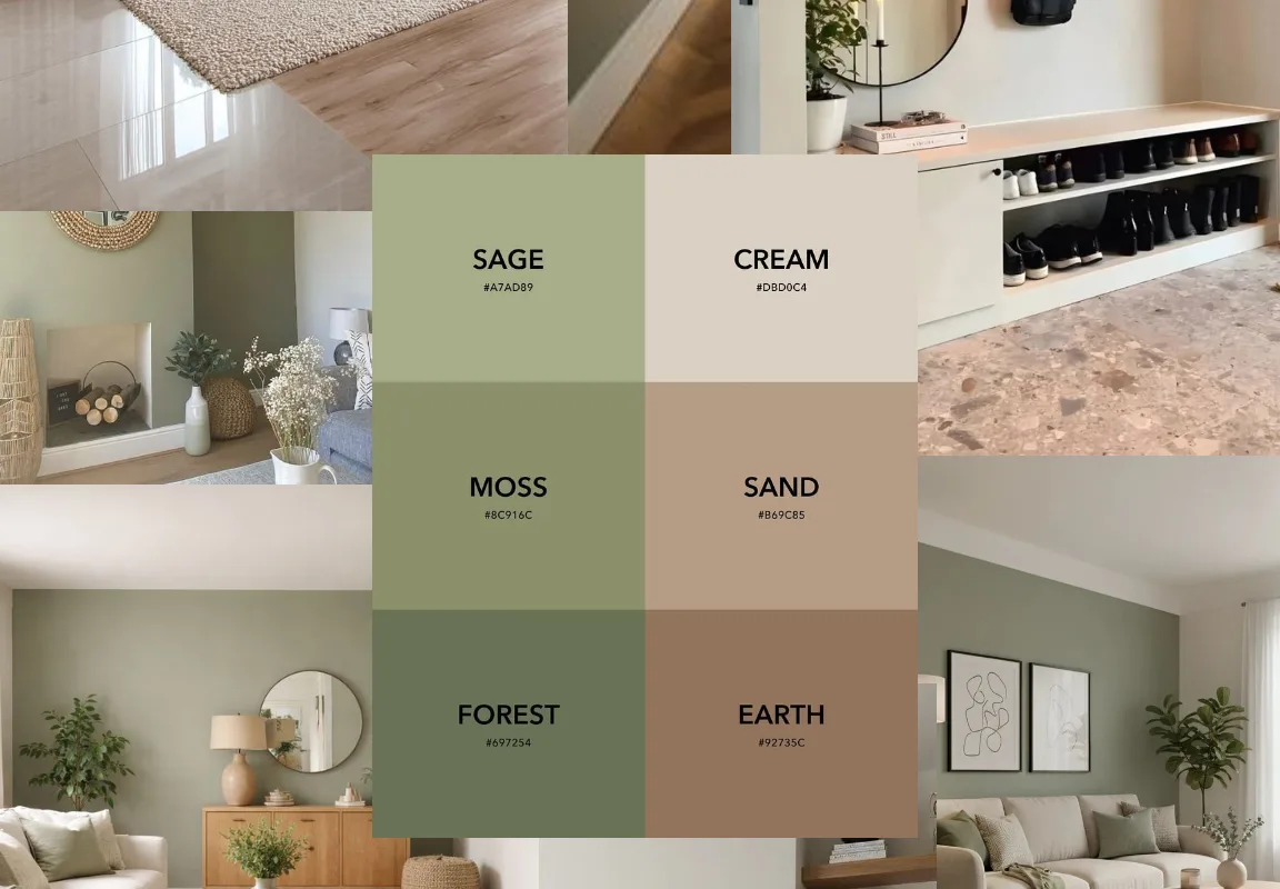
There’s something about sage green and warm beige that makes a room exhale. Maybe it’s the way those two tones sit together like a linen curtain catching afternoon light. Maybe it’s that they never scream for attention, yet somehow every guest asks what paint color you used. If you clicked through because you wanted a sage and beige moodboard you could actually build from, you’re in the right place. I’ve gathered 18 moodboard ideas, palettes, and tools that make pulling that soft, grounded look together feel less like a guessing game and more like a fun Saturday project. Let’s get into it.
Advertisements1
Table of Contents(Click to Toggle)
Why Sage and Beige Moodboards Work So Well
Sage and beige is one of those pairings that does the heavy lifting for you. Sage carries a cool, muted green undertone that reads as calm and slightly botanical, while beige brings warmth and a soft neutral base. Together they create contrast without conflict, which is exactly what a good moodboard needs. That balance is why the combination shows up everywhere from Scandinavian interiors to slow-living brand identities.
The trick is that “sage” and “beige” aren’t single colors. Sage can lean gray, blue, or yellow. Beige can lean pink, cream, or sand. A moodboard is how you figure out which version of each you actually love before you commit to paint, fabric, or a logo. The tools below range from quick color generators to full visual research platforms, so you can go as loose or as precise as you like. Pick two or three, and you’ll have a palette you trust in under an hour.
18 Sage and Beige Moodboard Ideas
1. Pinterest : The fastest way to collect sage and beige inspiration
What it is: A visual discovery and bookmarking platform built around boards you can fill with saved images.
Category: Inspiration board
Why it stands out:
- Search “sage and beige moodboard” and you’ll get thousands of ready-made palettes
- Board sections let you split interiors, fashion, and branding into separate streams
- The visual search tool finds similar images from a single pin you upload
Best for: Anyone starting from zero who wants volume and variety fast. If you’re not sure what direction you like, this is your first stop.
2. Coolors : Generate a full sage and beige palette in seconds
What it is: A color palette generator that builds five-color schemes with a tap of the spacebar.
Category: Color tool
Why it stands out:
- Lock the sage shade you love, then shuffle the rest until the beige feels right
- Contrast checker tells you if text will stay readable on your background color
- Export palettes straight to PNG, PDF, or a shareable link
Best for: Designers and DIYers who need exact hex codes, not just vibes. Great when you’re matching a paint sample to a fabric swatch.
3. Canva : Turn your palette into a polished moodboard layout
What it is: A drag-and-drop design platform with dedicated moodboard templates.
Category: Design tool
Why it stands out:
- Free moodboard templates sized for Instagram, print, or client decks
- Upload your own photos and drop them into grid or collage frames
- Color palette extractor pulls a matching scheme from any image you add
Best for: Sharing your sage and beige concept with a partner, client, or contractor who needs to see the whole picture at once.
4. Adobe Color : Pull a palette from a photo you already love
What it is: Adobe’s free color wheel and theme extraction tool.
Category: Color tool
Why it stands out:
- Upload a photo of a sage-toned room and it extracts the exact five-color story
- Harmony rules like analogous and muted keep your beige from going muddy
- Saved themes sync into Photoshop and Illustrator if you design professionally
Best for: People who found the perfect reference image and want to reverse-engineer its palette instead of guessing.
5. Behance : See how pros use sage and beige in real projects
What it is: Adobe’s portfolio network for creative professionals.
Category: Inspiration gallery
Why it stands out:
- Search “sage branding” or “earthy identity” for full case studies, not just single images
- Projects often include the palette, typography, and reasoning behind the choices
- You can follow studios whose aesthetic matches yours and get fresh work in your feed
Best for: Anyone building a brand, logo, or packaging concept who wants to see the color story applied end to end.
6. Dribbble : Bite-sized sage and beige UI and graphic inspiration
What it is: A show-and-tell community where designers post shots of their work.
Category: Inspiration gallery
Why it stands out:
- Color search lets you filter shots by a specific hex value
- Strong on web design, app interfaces, and illustration in muted tones
- Each shot links to the designer, which makes it easy to commission similar work
Best for: Web and product designers who want to see sage and beige translated into buttons, cards, and layouts.
7. Design Seeds : Daily palettes inspired by nature photos
What it is: A long-running blog that pairs a photograph with a color palette pulled from it.
Category: Color inspiration
Why it stands out:
- Every palette comes with the source image, so you see why the colors work
- Archive is searchable by color family, including greens and neutrals
- Simple, ad-light layout that loads fast on mobile
Best for: Slow browsers who want one beautiful palette a day rather than an endless scroll.
8. Colourlovers : Community-made palettes with clever names
What it is: A color community where members create, name, and rate palettes.
Category: Color community
Why it stands out:
- Search “sage” and you’ll find hundreds of user-built palettes with hex codes
- Each palette has a story or name that helps you remember the mood
- Free pattern and palette tools let you preview colors as repeating designs
Best for: Makers who want palette names and narratives to anchor their moodboard theme.
9. Houzz : Real rooms in sage and beige, with the paint names
What it is: A home remodeling and design platform with millions of photos.
Category: Interior inspiration
Why it stands out:
- Filter photos by color, room type, and style to narrow to sage and beige
- Many photos list the actual paint brand and color name used
- Discussion threads let you ask homeowners how a color looked in real light
Best for: Renovators who need to move from moodboard to paint chip without a costly mistake.
10. Unsplash : Free high-resolution photos for your board
What it is: A stock photo library where every image is free to use.
Category: Image source
Why it stands out:
- Search “sage green texture” or “beige linen” for clean, high-res tiles
- No attribution required, so images are safe for client decks and blogs
- Color filter lets you browse only images in a chosen hue
Best for: Filling gaps in a moodboard when your own photos don’t cover every texture you need.
11. Milanote : A purpose-built canvas for moodboards
What it is: A visual workspace where you arrange notes, images, and links on an infinite board.
Category: Moodboard app
Why it stands out:
- Drag images, swatches, and text anywhere, like pinning to a physical corkboard
- Built-in color swatch cards keep your sage and beige codes in one place
- Share a read-only link so collaborators can view without editing
Best for: Creatives who think spatially and want one board that holds references, notes, and palette together.
12. Figma : Precise, collaborative moodboards with real color styles
What it is: A browser-based design tool with multiplayer editing.
Category: Design tool
Why it stands out:
- Save sage and beige as reusable color styles across every frame
- Multiple people can move images and comment in real time
- Plugins pull palettes from Coolors and Unsplash without leaving the file
Best for: Teams and freelancers who need a moodboard that doubles as a working design file. Slight learning curve if you’ve never used it.
13. Are.na : Quiet, ad-free visual research channels
What it is: A platform for collecting and connecting ideas into channels.
Category: Visual research
Why it stands out:
- No algorithm, no ads, no likes, just images and text you choose to keep
- You can connect blocks across channels to build a web of related references
- Public channels from other users are a goldmine of muted, earthy aesthetics
Best for: Deep researchers who want a calm archive instead of a feed. Best on desktop for arranging blocks.
14. Savee : A sleek visual bookmarking space for creatives
What it is: An image-saving platform popular with designers and art directors.
Category: Inspiration board
Why it stands out:
- Browser extension saves any image in one click to a themed board
- Boards are clean and grid-based, so palettes read clearly at a glance
- Strong community of interior, fashion, and graphic references
Best for: People who save images constantly and want a tidier home for them than a camera roll.
15. Cosmos : Algorithmic discovery for a specific aesthetic
What it is: A visual discovery app that learns your taste from what you save.
Category: Inspiration app
Why it stands out:
- Feed sharpens quickly toward muted, earthy, minimalist imagery
- Clusters group visually similar images so you can spot a palette forming
- Clean mobile experience built for scrolling and saving
Best for: Mobile-first browsers who want the app to surface sage and beige references without typing a search.
16. Paletton : Classic color wheel for building harmonious schemes
What it is: A free color scheme designer based on traditional color theory.
Category: Color tool
Why it stands out:
- Pick a base sage and it suggests complementary, triadic, and adjacent beiges
- Live preview shows your palette applied to a sample web page layout
- No account needed, and it works offline once loaded
Best for: Anyone who wants to understand why a palette works, not just copy it. Interface feels dated but the logic is solid.
17. Color Hunt : Curated four-color palettes, endlessly scrollable
What it is: A simple gallery of hand-picked four-color combinations.
Category: Color inspiration
Why it stands out:
- Filter by tag to find muted, pastel, or earth-tone collections
- Each palette shows hex codes on hover for instant copying
- Minimal interface that loads almost instantly on any device
Best for: A quick palette pick when you need four colors that already work together. Less depth than Coolors, more curation.
18. Pexels : Free photos and video for texture layers
What it is: A free stock library covering photos and short video clips.
Category: Image source
Why it stands out:
- Search “beige ceramic” or “sage plant close-up” for tactile texture shots
- Video clips let you build a moving moodboard for reels or presentations
- Free for commercial use with no attribution required
Best for: Adding material texture like linen, stone, and clay that makes a flat palette feel physical.
Bonus Mentions
ColorKit : Free palette generator with gradient and contrast tools
A lightweight companion to the bigger color tools, handy when you want a gradient version of your sage and beige scheme for a website background.
Remove.bg : Clean up product or plant photos before adding them to a board
Drop in a photo and it strips the background in seconds, which keeps your moodboard looking uniform instead of cluttered.
Notion : Document the why behind each moodboard choice
Pair images with notes on paint brands, fabric sources, and budget so your board becomes an action plan, not just a pretty page.
Google Arts and Culture : Historic artworks in muted green and cream
Searching museum collections for landscape paintings is an underrated way to find sage and beige combinations that have stood the test of time.
Building Your Own Sage and Beige Story
Here’s the thing about sage and beige: the palette is calm, but the process of building it doesn’t have to be boring. Start with one tool that gives you volume, like Pinterest or Are.na, then move to a color tool like Coolors or Adobe Color to lock your exact shades. From there, a layout tool such as Canva or Milanote turns the collection into something you can share, print, or hand to a painter.
Don’t overthink the “perfect” sage. Every screen renders it slightly differently, and natural light will shift it again in your actual room. Grab a few paint chips, tape them to the wall, and watch them through the day. Improvise a little. Swap one beige for a warmer sand if the room feels cold, or add a deeper olive if it feels flat. The moodboard is a starting point, not a contract.
My favorite trick is to keep one board that’s purely texture: linen, clay, unglazed ceramic, dried eucalyptus. When you layer those next to your color swatches, the palette suddenly feels like a place instead of a paint deck. That’s when a moodboard stops being homework and starts being the fun part.
Which sage and beige find are you most excited to try first? Drop your favorite tool or palette in the comments so other readers can borrow it. Cook smart, eat happy.

Elena focuses on healthy cooking and meal prep for people with limited time and budget. She shares flexible recipes and shortcuts that don’t sacrifice flavor.


