

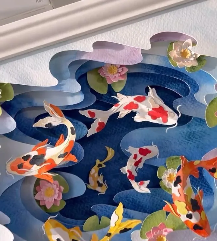
There is a particular stillness that comes from folding paper into water. I first discovered this on a grey Tuesday, when a sheet of blue tissue and a handful of pebbles became a pond on my windowsill. In this article, I will share seven hacks to help you build your own paper pond—each one tested, each one simple, each one a small invitation to slow down.
Advertisements1
- Torn edges, not cut, create a natural water illusion.
- Three layers of paper are enough to suggest depth; more muddies it.
- Dry-brushing with diluted acrylic mimics ripples without overwhelming.
- Natural anchors like pebbles or petals ground the scene and invite touch.
- Display at eye level or below to enhance the sense of looking into water.
- Keep the pond out of direct sunlight and dust to preserve it.
Choosing the Right Paper for Water
Not all paper behaves like water. Tissue paper, with its 17 gsm weight, absorbs light and colour in a way that mimics depth. I often use two layers: a base of deep cerulean and a top layer of pale aqua, torn—not cut—so the edges feather like ripples. The tearing matters; scissors leave a hard line that reads as paper, not pond.
Why it works: torn edges diffuse light, creating the illusion of a soft, liquid surface. A common mistake is using glossy or coated paper, which reflects light too sharply and looks like plastic. Stick to uncoated, matte stocks. I learned this after a batch of origami paper turned my pond into a mirror.
For lily pads, I prefer 60 gsm cardstock in olive green. It holds a slight curl when dampened, which gives a natural lift. Let the paper guide you—sometimes the best ponds are accidents of texture.
Building Depth with Layers and Light
A pond is not flat; it has volume. To suggest depth, I build three layers: a dark base (indigo or charcoal), a mid-tone (teal or moss), and a highlight (pale mint or silver). Each layer is slightly smaller, offset by a few millimeters. This creates a sense of looking into water.
Light is your collaborator. Place your pond near a window with diffused daylight—north-facing is ideal. The changing light throughout the day will make the paper seem to move. Avoid direct sunlight, which fades colours and creates harsh shadows.
One mistake I see often: over-layering. Too many layers muddle the depth and make the pond look busy. Three is plenty. Remember, water is simple; it is the reflections that are complex.
Adding Natural Elements: Pebbles, Petals, and Stems
Paper alone can feel sterile. I like to introduce small natural elements: a single pebble from a walk, a dried petal, a twig no thicker than a matchstick. These anchors ground the scene and invite touch. The pebble, especially, adds weight and a point of focus.
When placing elements, follow the rule of thirds. Imagine a grid over your pond; place your focal point at an intersection. This creates balance without symmetry. A common mistake is overcrowding—a pond should have breathing room. I once added too many petals and it looked like a salad.
Attach elements with a dab of clear-drying glue (I use PVA diluted with water, 1:1). It dries invisible and holds without stiffness. For floating petals, simply rest them on the surface; they will cast tiny shadows that read as ripples.
Creating Ripples and Reflections
Ripples are the soul of a pond. To mimic them, I use a technique called 'dry brushing': I dip a stiff brush in slightly diluted white acrylic and drag it lightly across the paper's surface in concentric arcs. The brush should be almost dry—hence the name—so the paint catches only the raised texture of the paper.
Reflections are subtler. I cut thin strips of silver or pale blue paper and curl them with a scissor blade, then place them near the edges. They catch the light and suggest sky or trees. Mistake to avoid: making reflections too literal. A few suggestion lines are enough; the eye fills in the rest.
If you want a mirror-like finish, try a very light wash of iridescent medium over the base layer. It adds a sheen that shifts with the light, like real water.
Incorporating Seasonal Touches
A pond can be any season. In spring, I add tiny paper blossoms—quince or cherry—floating on the surface. In autumn, a single maple leaf, its edges curled. Winter calls for a rim of white paper 'ice' and bare twigs. These details make the pond a living thing, not a static craft.
Seasonal changes also affect your colour palette. Spring: soft pinks and fresh greens. Summer: deep blues and vivid greens. Autumn: amber, rust, and gold. Winter: silver, white, and slate. I keep a small box of pre-cut shapes for each season, so I can change the pond's mood in minutes.
One mistake is mixing seasons—a cherry blossom in a snowy scene feels disjointed. Stay within one season for coherence. Let the pond tell a single story.
Displaying and Preserving Your Paper Pond
A paper pond is fragile. I display mine in a shallow wooden tray or a glass cloche to protect it from dust and curious fingers. If you use a cloche, ensure it has a small vent; trapped moisture can warp the paper. I learned this after a humid week turned my pond into a wave.
For preservation, keep the pond out of direct sunlight and away from heat sources. A light dusting with a soft brush every few weeks is enough. If you must store it, place it between sheets of acid-free tissue in a flat box.
Display it at eye level or slightly below—ponds are meant to be looked down upon. This angle enhances the illusion of depth. A quiet corner, a low shelf, a bedside table: these are the places where a paper pond feels most at home.
The Quiet Joy of Making
There is no rush in this craft. Each fold, each tear, each placement is a small meditation. I often work in silence, listening to the paper's whisper as I shape it. The pond becomes a record of that time—a still, blue memory.
You do not need many tools: a scalpel, a brush, some glue, and patience. The rest is attention. And attention, I have found, is the rarest material of all.
When you finish, step back. Let the pond sit for a day before you judge it. Light will change, and so will your perception. The imperfections—a slightly crooked lily pad, a ripple that goes astray—are where the life is.
The Hacks, Step by Step
- 1Gather your materials
Collect tissue paper in blues and greens, 60 gsm cardstock, a scalpel, a stiff brush, diluted PVA glue, and a shallow tray. Why: having everything at hand keeps you in a calm, focused rhythm. Mistake: using glossy paper—it reflects light unnaturally. - 2Tear, don't cut, the water layers
Tear three layers of tissue paper in decreasing sizes. Why: torn edges mimic the soft boundaries of water. Mistake: cutting with scissors creates hard lines that break the illusion. - 3Build depth with three layers
Stack the layers, offsetting each by a few millimeters. Why: this creates a sense of volume and depth. Mistake: over-layering—three is enough; more muddies the effect. - 4Add natural anchors
Place a pebble, a dried petal, or a twig at a rule-of-thirds intersection. Why: these elements ground the scene and provide a focal point. Mistake: overcrowding—leave breathing room. - 5Dry-brush ripples
Dip a stiff brush in diluted white acrylic, wipe most off, and drag in arcs across the surface. Why: this catches the paper's texture, suggesting ripples. Mistake: using too much paint—it will look like snow, not water. - 6Add subtle reflections
Curl thin strips of silver paper and place near edges. Why: they catch light and suggest sky or trees. Mistake: making reflections too literal—a few lines suffice. - 7Display under a vented cloche
Place the pond in a shallow tray under a glass cloche with a small vent. Why: protects from dust while allowing airflow. Mistake: sealing it completely—trapped moisture warps paper.
A paper pond is not about perfection; it is about the quiet attention you give to each fold and tear.
Frequently Asked Questions
What kind of paper is best for a paper pond?
Uncoated tissue paper (17 gsm) and matte cardstock (60 gsm) work best because they absorb light and colour naturally. Avoid glossy or coated papers, which reflect light too sharply and look artificial.
How do I make the water look realistic?
Use three layers of torn tissue paper in decreasing sizes to create depth, then dry-brush diluted white acrylic in arcs to suggest ripples. Subtle reflections from curled silver paper strips add realism without being literal.
Can I use real water in a paper pond?
No, real water will warp and ruin the paper. The illusion of water is achieved through layering, light, and texture. If you want a water element, use a thin layer of clear resin or iridescent medium, but test on scrap paper first.
How do I preserve a paper pond?
Display it under a vented glass cloche or in a shallow tray away from direct sunlight and heat. Dust gently with a soft brush. For storage, place between acid-free tissue in a flat box.
What seasonal variations can I make?
Add paper blossoms for spring, amber leaves for autumn, or white 'ice' rims and bare twigs for winter. Stick to one season per pond for coherence, and adjust your colour palette accordingly.


