

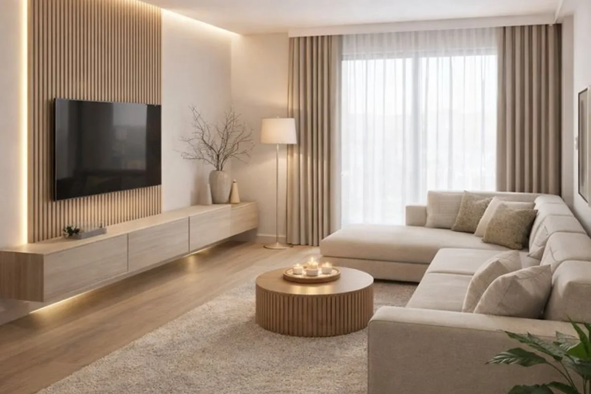
The text on the pin promised a minimalist living room, and that is exactly what this list delivers: 21 concrete ways to strip a living room down to what actually works. No vague “declutter your life” advice. Real numbers, real sources, real trade-offs.
Advertisements1
Here is the math most people skip. A typical living room holds 40 to 60 visible objects. A genuinely minimal room holds 12 to 18. That gap is not about throwing things away. It is about choosing the right pieces and refusing the rest. Each item below is a resource or method you can use this week.
Table of Contents(Click to Toggle)
- Why a Minimalist Living Room Pays Off
- 21 Minimalist Living Room Resources and Ideas
- 1. Studio McGee
- 2. The Spruce
- 3. Apartment Therapy
- 4. Remodelista
- 5. Dwell
- 6. Pinterest
- 7. Houzz
- 8. IKEA
- 9. MUJI
- 10. Article
- 11. Floyd Home
- 12. Menu
- 13. Farrow & Ball
- 14. Coolors
- 15. The 60-30-10 Color Rule
- 16. The One-In-One-Out Rule
- 17. The 3-Item Surface Rule
- 18. Hidden Storage Furniture
- 19. Layered Lighting
- 20. The 18-Inch Walkway Rule
- 21. Negative Space Framing
- Bonus Mentions
- The Quiet Room Standard
Why a Minimalist Living Room Pays Off
Minimalism is not an aesthetic. It is a budget decision, a cleaning decision, and a decision about how much attention you want to spend on your own furniture.
Run the numbers on a standard 200-square-foot living room. Filling it at mid-market prices with a sofa, two chairs, coffee table, media console, rug, floor lamp, table lamp, and eight decorative objects runs roughly $3,400 to $5,200. A minimal version with a sofa, one chair, a coffee table, a rug, and two lamps runs $1,800 to $2,600. That is a 40 to 50 percent reduction, and the room is easier to clean because there is less surface area collecting dust.
There is a real risk to flag. Under-furnishing a large room can make it feel cold and echoey. Hard floors plus bare walls produce noticeable reverb. If your room is over 250 square feet, keep one soft element per 60 square feet: a rug, a curtain, or an upholstered piece. That keeps the acoustics livable without adding clutter.
Below are 21 resources and rules. The first several are where you find pieces and inspiration. The later ones are the rules that keep the room from drifting back into clutter.
21 Minimalist Living Room Resources and Ideas
1. Studio McGee : Warm minimalism with real room layouts
What it is: An interior design studio and retail brand with a large library of finished living room projects.
Category: Design inspiration and shoppable furniture.
Why it stands out:
- Their rooms show how to keep a neutral palette from looking sterile, usually by mixing two wood tones.
- Most project pages list the actual products used, so you can price a similar room yourself.
- Limitation: the in-house furniture line leans expensive, often $1,200 or more for a sofa.
Best for: Anyone who wants minimal but not cold, and who needs a visual reference before buying.
2. The Spruce : Practical how-to guides with measured dimensions
What it is: A home advice site covering decorating, cleaning, and layout.
Category: Guides and reference.
Why it stands out:
- Articles give concrete numbers, such as rug sizes for specific sofa lengths and standard coffee table heights.
- Their decluttering pieces are step-based, not motivational, which makes them actually usable.
- Limitation: ad density is high on mobile, so expect interruptions.
Best for: Readers who want measurements and instructions rather than mood boards.
3. Apartment Therapy : Small-space solutions from real homes
What it is: A home tour site focused on apartments and smaller houses.
Category: Real-home tours and small-space advice.
Why it stands out:
- The house tours are photographed as lived-in, which is more honest than staged catalog shots.
- Their small-space coverage regularly addresses rooms under 150 square feet, a common blind spot.
- Limitation: tour quality varies widely, so filter by square footage before you read.
Best for: Renters and small-apartment dwellers who cannot change the architecture.
4. Remodelista : Material-first design with a restrained palette
What it is: An editorial site covering interiors, renovation, and sourcing.
Category: Design editorial and sourcing guides.
Why it stands out:
- Their sourcing guides point to specific makers, which helps you avoid mass-market lookalikes.
- Coverage leans toward natural materials like oak, linen, and stone that age well.
- Limitation: many sourced pieces are trade-priced or made to order.
Best for: Buyers willing to spend more per piece and own fewer of them.
5. Dwell : Architecture-led minimalism with clean sightlines
What it is: A modern architecture and design magazine with a strong online archive.
Category: Architecture and interior inspiration.
Why it stands out:
- The projects explain structural choices, such as built-in storage replacing freestanding furniture.
- Useful if you are planning a renovation and want to reduce visible objects permanently.
- Limitation: much of the content assumes a renovation budget.
Best for: Homeowners planning built-ins or a layout change, not quick decor swaps.
6. Pinterest : Fast visual filtering before you commit
What it is: A visual search and bookmarking platform.
Category: Inspiration and planning.
Why it stands out:
- You can build a board of 20 to 30 room images and spot the repeating elements in about 15 minutes.
- Board sections let you separate “sofa options” from “lighting options” so decisions stay isolated.
- Limitation: it is easy to collect 300 images and still buy nothing, so cap the board.
Best for: Narrowing a direction fast, especially if you do not know your own taste yet.
7. Houzz : Photo search filtered by room size and style
What it is: A home design platform with photos, product listings, and professional profiles.
Category: Inspiration and sourcing.
Why it stands out:
- Filters let you search by room type, style, and color, which cuts browsing time sharply.
- Many photos include dimensions, which is rare and genuinely useful for planning.
- Limitation: the marketplace pushes you toward hiring professionals.
Best for: Planning around a fixed room size rather than browsing freely.
8. IKEA : Affordable core pieces with known dimensions
What it is: A global furniture retailer with published measurements for every product.
Category: Furniture and storage.
Why it stands out:
- Every listing states width, depth, and height, so you can check fit before ordering.
- Storage series like BESTA and PAX let you hide objects behind flat doors, which is the fastest route to visual calm.
- Limitation: particleboard construction does not survive repeated disassembly.
Best for: Filling a room on a defined budget without guesswork.
9. MUJI : Quiet, low-contrast pieces that disappear into a room
What it is: A Japanese retailer known for unbranded, functional home goods.
Category: Furniture, storage, and textiles.
Why it stands out:
- Their storage units use consistent dimensions across the range, so modules stack and combine cleanly.
- Neutral tones reduce visual noise without requiring a strict color plan.
- Limitation: pricing in North America runs higher than in Japan, and stock rotates often.
Best for: Buyers who want pieces that read as background, not statement.
10. Article : Mid-range modern furniture shipped direct
What it is: A direct-to-consumer furniture brand with a modern, restrained catalog.
Category: Furniture.
Why it stands out:
- Sofas typically land between $1,000 and $2,000, a middle band between budget and designer.
- The catalog is small enough to browse fully in one sitting, which reduces decision fatigue.
- Limitation: delivery windows can stretch several weeks on popular models.
Best for: Buyers upgrading from flat-pack but not ready for designer pricing.
11. Floyd Home : Modular pieces that move with you
What it is: A furniture company built around modular, repairable designs.
Category: Modular furniture.
Why it stands out:
- Components clamp together without tools, so a shelving unit can become a bench later.
- Spare parts are sold separately, which extends the usable life of each piece.
- Limitation: the industrial look is specific and will not suit every room.
Best for: Renters who move every few years and want furniture that adapts.
12. Menu : Sculptural minimalism for one focal piece
What it is: A Danish design brand producing furniture and objects with a sculptural edge.
Category: Designer furniture and lighting.
Why it stands out:
- Their pieces are designed to stand alone, which suits a room with only one or two objects.
- Lighting in particular works as a focal point without added decor.
- Limitation: prices are high, so this is a one-piece-at-a-time purchase.
Best for: Buyers who want a single anchor object instead of many small ones.
13. Farrow & Ball : Paint colors that reduce visual clutter
What it is: A British paint and wallpaper company with a curated color range.
Category: Paint and finishes.
Why it stands out:
- Their muted, greyed tones make walls recede, which makes a room feel calmer without removing anything.
- Sample pots let you test a color on your own wall in daylight before committing.
- Limitation: coverage per tin is lower than some budget brands, so cost per wall runs higher.
Best for: Anyone whose room feels busy mainly because of wall color.
14. Coolors : Build a five-color palette in under five minutes
What it is: A free color palette generator with export tools.
Category: Color planning tool.
Why it stands out:
- You can lock your wall color and generate four matching accents, which prevents random purchases.
- Palettes export as hex codes you can keep on your phone while shopping.
- Limitation: it will not tell you how a color looks in your specific light.
Best for: Anyone who keeps buying objects that do not match the room.
15. The 60-30-10 Color Rule
What it is: A proportion rule for splitting a room’s color into dominant, secondary, and accent shares.
Category: Design rule.
Why it stands out:
- In a 200-square-foot room, that means roughly 60 percent neutral walls and large furniture, 30 percent a secondary tone like wood or upholstery, and 10 percent accent.
- It gives you a hard cap on accents, which is where most rooms get noisy.
- Limitation: strict adherence can look formulaic, so treat the accent share as a ceiling, not a target.
Best for: Buyers who need a rule to stop impulse accent purchases.
16. The One-In-One-Out Rule
What it is: A maintenance rule: every new object entering the room replaces an existing one.
Category: Maintenance rule.
Why it stands out:
- It holds object count flat over time, which is the actual goal of minimalism.
- Applied to decor only, it typically prevents 10 to 15 new small items per year.
- Limitation: it requires a donation box or storage space to hold the outgoing item.
Best for: Rooms that keep drifting back toward clutter.
17. The 3-Item Surface Rule
What it is: A cap of three objects on any visible horizontal surface.
Category: Styling rule.
Why it stands out:
- A coffee table, two side tables, and a console means a maximum of 12 objects total, which is measurable.
- It forces you to choose the best objects instead of displaying all of them.
- Limitation: surfaces that need function, like a desk, need a separate rule.
Best for: Fast visual cleanup without buying anything.
18. Hidden Storage Furniture
What it is: Furniture with enclosed compartments that hold objects out of sight.
Category: Storage strategy.
Why it stands out:
- A single enclosed console can hide 20 to 30 small items that would otherwise sit on open shelves.
- Flat-door fronts read as wall, not furniture, which keeps sightlines clean.
- Limitation: enclosed storage hides mess but does not reduce it, so review contents twice a year.
Best for: Anyone with real daily items like remotes, chargers, and mail.
19. Layered Lighting
What it is: Using three light sources at different heights instead of one ceiling fixture.
Category: Lighting strategy.
Why it stands out:
- A floor lamp, a table lamp, and a ceiling or wall light give you control over mood without adding decor.
- Warm bulbs around 2700K make a minimal room feel intentional rather than clinical.
- Limitation: more fixtures means more cords, so plan outlet placement first.
Best for: Rooms that feel flat or cold after decluttering.
20. The 18-Inch Walkway Rule
What it is: Keep at least 18 inches of clear floor between furniture pieces on main walking paths.
Category: Layout rule.
Why it stands out:
- Below 18 inches, a room feels cramped even if it holds very little furniture.
- Measuring paths before buying prevents returns, which is where furniture budgets quietly leak.
- Limitation: small rooms may need to drop a piece entirely to meet the number.
Best for: Anyone about to buy a second chair or a larger sofa.
21. Negative Space Framing
What it is: Deliberately leaving wall and floor areas empty to frame the pieces you keep.
Category: Composition strategy.
Why it stands out:
- One artwork centered on a 10-foot wall reads stronger than four artworks spread across it.
- Empty floor around a sofa makes the sofa look intentional rather than crowded.
- Limitation: it requires resisting the urge to fill gaps during sales.
Best for: Rooms that already have good pieces but no breathing room.
Bonus Mentions
West Elm : Mid-range modern with frequent markdowns
A reliable fallback when Article is out of stock. Their contract-grade sofas hold up better than the standard line. Watch the sale cycle rather than buying at full price.
CB2 : Sharper silhouettes at accessible prices
Useful when you want one piece with more edge. Quality is inconsistent across categories, so inspect in store when possible.
HAY : Affordable Scandinavian design
Good middle ground between mass market and designer. Their small accessories are often the best value in the catalog.
2Modern : Authorized dealer for design brands
Useful for comparing prices across brands before committing. Check lead times carefully, as some pieces ship in 12 weeks or more.
The Quiet Room Standard
A minimalist living room is not defined by how much you remove. It is defined by whether every remaining object has a job. Apply the numbers in this list and you get a room that costs 40 to 50 percent less to furnish, takes less time to clean, and stays that way because the rules are measurable rather than aspirational.
The risks are real and worth repeating. Under-furnish a large room and it will echo. Hide everything in closed storage and you will forget what you own. Follow the 60-30-10 split too literally and the room will look like a template. Use the rules as limits, not as a personality.
Start with one item from this list this week. Measure your walkways, cap your surfaces at three objects, and pick a single anchor piece before buying anything else. That sequence alone prevents most of the spending mistakes people make in living rooms.
Which of these 21 did you try first, and what did it change about the room?
Stay sharp, stay solvent.

Diego covers personal finance and investing for freelancers and gig workers. His angle is practical money management for irregular income, from budgeting to tax basics.


