

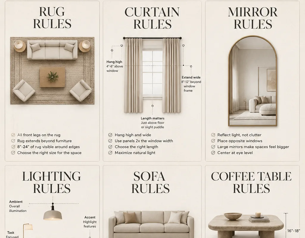
Ever walk into a room and just feel that it’s right? The sofa sits perfectly, the curtains kiss the ceiling, and the rug actually fits the space instead of floating like a lonely island. That feeling isn’t magic, and it isn’t a six-figure budget. It’s a handful of rules that professional interior designers use over and over, and once you know them, you can’t unsee them.
Advertisements1
I’m Elena Vasquez, and I’ve spent years collecting these little secrets from designer friends, showroom visits, and a whole lot of trial and error in my own living room. Below you’ll find 17 rules plus a few bonus mentions, each one broken down so you can apply it this weekend. No demolition required. Let’s make your home feel intentional.
Table of Contents(Click to Toggle)
- Why These Designer Rules Change Everything
- The 17 Interior Designer Rules
- 1. The 8 to 10 Inch Rule for Rug Size
- 2. Hang Curtains High and Wide
- 3. The 18 Inch Coffee Table Gap
- 4. Anchor the Sofa on the Rug
- 5. Float Furniture Off the Walls
- 6. Hang Mirrors at Eye Level
- 7. Layer Three Light Sources
- 8. Follow the 60-30-10 Color Rule
- 9. Keep Art at 57 Inches Center
- 10. Match Nightstand Height to Mattress
- 11. Use Odd Numbers in Styling
- 12. Choose One Statement Piece Per Room
- 13. Leave Breathing Room on Shelves
- 14. Repeat Materials Three Times
- 15. Put the Largest Furniture on the Longest Wall
- 16. Add a Fifth Wall Moment
- 17. Edit Before You Add
- Bonus Mentions
- The Rules That Make a House Feel Designed
Why These Designer Rules Change Everything
Here’s the thing about a beautiful room: it’s rarely about expensive furniture. It’s about proportion, placement, and light. A $200 rug in the right size can outshine a $2,000 rug that’s too small. Curtains hung at the correct height can make a standard window look architectural. These are the quiet decisions that separate a room that feels “finished” from one that feels like a work in progress.
The best part? Most of these rules cost nothing to apply. They’re about measuring twice, trusting your eye, and knowing the numbers designers keep in their heads. Treat this list like a checklist. Even three or four fixes will transform how a space reads. And if you improvise along the way, even better, that’s where personality lives.
The 17 Interior Designer Rules
1. The 8 to 10 Inch Rule for Rug Size : The measurement that makes any living room look intentional
What it is: A sizing guideline: your area rug should extend 8 to 10 inches beyond every edge of the sofa and chairs that sit on it.
Category: Layout and proportion
Why it stands out:
- It instantly fixes the “floating rug” look that makes rooms feel unfinished
- It works for any style, from modern to traditional
- It’s free to check with a tape measure before you buy
Best for: Anyone who has ever bought a rug that turned out too small. Tape out the size on your floor first, and you’ll never guess wrong again.
2. Hang Curtains High and Wide : The trick that makes ceilings look taller
What it is: Mount curtain rods 4 to 6 inches below the ceiling, and extend them 6 to 10 inches past the window frame on each side.
Category: Windows and vertical space
Why it stands out:
- Raises the visual ceiling without any renovation
- Lets more light in when curtains are open
- Makes windows look larger and more custom
Best for: Renters and homeowners alike. If you can drill a hole, you can do this. Substitution tip: use a tension rod if you can’t drill, and still hang it high.
3. The 18 Inch Coffee Table Gap : The spacing that keeps conversation easy
What it is: Leave 14 to 18 inches between your sofa and coffee table so people can walk through and reach a drink comfortably.
Category: Furniture spacing
Why it stands out:
- Prevents the cramped feeling of a table pushed too close
- Keeps the room walkable without a visible traffic jam
- Easy to test by simply scooting the table
Best for: Living rooms where the sofa and table currently touch. Try 16 inches as a starting point and adjust to your body.
4. Anchor the Sofa on the Rug : The rule that pulls a seating area together
What it is: At least the front legs of every major seat should sit on the rug, with the back legs allowed to rest off it.
Category: Layout and proportion
Why it stands out:
- Creates a visual boundary that defines the conversation zone
- Works in open-plan rooms where furniture drifts
- Makes a smaller rug function like a larger one
Best for: Open living spaces. If your rug is too small to reach, layer it over a larger neutral jute rug for an instant fix.
5. Float Furniture Off the Walls : The move that makes rooms feel bigger
What it is: Pull seating away from the wall and let it float in the room, especially in larger spaces.
Category: Layout
Why it stands out:
- Creates a cozy island instead of a waiting-room lineup
- Improves flow around the seating area
- Highlights the architecture of the room itself
Best for: Rooms longer than 12 feet. In tiny rooms, wall-hugging is still your friend, so use judgment.
6. Hang Mirrors at Eye Level : The placement that reflects light, not confusion
What it is: Center a mirror at roughly 57 to 60 inches from the floor, or align it with the top of the nearest door frame.
Category: Wall decor
Why it stands out:
- Bounces natural light deeper into the room
- Makes small spaces feel twice as open
- Avoids the awkward “mirror staring at the ceiling” look
Best for: Entryways and dark hallways. Place it opposite a window for maximum glow.
7. Layer Three Light Sources : The formula for a room that glows at night
What it is: Use three types of light in one room: ambient (ceiling), task (reading lamp), and accent (sconce or picture light).
Category: Lighting
Why it stands out:
- Kills the harsh single-overhead-light look
- Adds warmth and depth after sunset
- Lets you change the mood with a dimmer
Best for: Living rooms and bedrooms. Add warm bulbs around 2700K for a cozy feel.
8. Follow the 60-30-10 Color Rule : The ratio that keeps palettes balanced
What it is: 60 percent dominant color, 30 percent secondary, 10 percent accent.
Category: Color
Why it stands out:
- Prevents a room from feeling chaotic or flat
- Makes accent pillows and art feel deliberate
- Works with any style, from minimal to maximal
Best for: Anyone starting a room from scratch. Use your walls and rug as the 60, sofa as the 30, and throw pillows as the 10.
9. Keep Art at 57 Inches Center : The gallery standard that feels right
What it is: Hang art so the center of the piece sits 57 inches from the floor, the average human eye level.
Category: Wall decor
Why it stands out:
- Makes every piece feel connected to the viewer
- Prevents the “too high” mistake almost everyone makes
- Simple to mark with painter’s tape before nailing
Best for: Gallery walls and single statement pieces. In a dining room, go a touch higher, around 60 inches.
10. Match Nightstand Height to Mattress : The bedroom rule that looks custom
What it is: Choose nightstands that are level with or within 2 inches of your mattress top.
Category: Bedroom
Why it stands out:
- Makes the bed look tailored instead of mismatched
- Keeps your lamp and book within easy reach
- Balances the visual weight on both sides of the bed
Best for: Any bedroom. Measure your mattress height before shopping, it saves returns.
11. Use Odd Numbers in Styling : The rule that makes shelves look collected
What it is: Group accessories in threes or fives rather than pairs.
Category: Styling
Why it stands out:
- Feels natural instead of symmetric and stiff
- Gives the eye a clear focal point
- Works on coffee tables, mantels, and shelves
Best for: Bookshelf and console styling. Vary heights within the group so it doesn’t look like a lineup.
12. Choose One Statement Piece Per Room : The focus rule that prevents clutter
What it is: Let one item, a chandelier, a bold sofa, a large artwork, be the star, and keep everything else supporting.
Category: Styling
Why it stands out:
- Gives the room a clear identity
- Keeps competing pieces from fighting for attention
- Makes a single splurge feel worth it
Best for: Rooms that feel “almost there” but busy. Remove or soften one loud element and watch the room calm down.
13. Leave Breathing Room on Shelves : The negative space rule
What it is: Fill only about two-thirds of each shelf, leaving empty space around objects.
Category: Styling
Why it stands out:
- Makes collections look curated, not crowded
- Lets each object be seen
- Easier to dust and rearrange
Best for: Bookcases and kitchen open shelving. Style in a zigzag pattern across shelves for flow.
14. Repeat Materials Three Times : The cohesion trick
What it is: Use a material, wood, brass, black metal, at least three times in a room.
Category: Materials
Why it stands out:
- Ties mismatched furniture together
- Creates a subtle rhythm the eye enjoys
- Works with any budget
Best for: Open-plan spaces. Repeat warm wood in a coffee table, frame, and bowl for instant cohesion.
15. Put the Largest Furniture on the Longest Wall : The balance rule
What it is: Anchor your biggest piece, usually the sofa, against the longest uninterrupted wall.
Category: Layout
Why it stands out:
- Prevents the room from feeling lopsided
- Creates a natural focal point
- Makes traffic flow obvious
Best for: Rectangular living rooms. If there’s a fireplace, let it share the spotlight on the adjacent wall.
16. Add a Fifth Wall Moment : The ceiling detail that surprises
What it is: Treat the ceiling as a design surface with paint, wallpaper, or a wood beam.
Category: Architectural detail
Why it stands out:
- Adds character to builder-basic rooms
- Draws the eye upward and makes rooms feel taller
- Can be done with paint for very little cost
Best for: Dining rooms and bedrooms. A soft tint on the ceiling is a subtle, low-risk start.
17. Edit Before You Add : The rule that keeps a home feeling calm
What it is: Before buying something new, remove one thing you no longer love.
Category: Styling philosophy
Why it stands out:
- Prevents clutter from creeping in
- Makes every remaining object feel chosen
- Costs nothing and takes five minutes
Best for: Anyone who feels their home is “full but not finished.” Try it on a coffee table first.
Bonus Mentions
IKEA : The budget testing ground for layout ideas
What it is: A source for affordable basics and room-set inspiration.
Category: Shopping
Why it stands out:
- Room displays show real proportions you can copy
- Cheap way to test a color or shape before committing
- Great for rugs and lighting on a starter budget
Best for: First apartments and rental-friendly upgrades.
Target : Affordable designer collaborations
What it is: A retailer with recurring designer collections for home decor.
Category: Shopping
Why it stands out:
- Trend-forward pieces at accessible prices
- Easy returns if a size or color misses
- Good source for accent lighting and textiles
Best for: Quick refreshes without a big spend.
Etsy : One-of-a-kind art and handmade details
What it is: A marketplace for independent makers and vintage sellers.
Category: Shopping
Why it stands out:
- Unique art and ceramics you won’t see everywhere
- Custom sizes for tricky walls
- Supports small businesses
Best for: Statement art and personalized pieces.
Pinterest : Your free mood board tool
What it is: A visual search and saving platform.
Category: Planning
Why it stands out:
- Collect room ideas in one board before buying
- Spot patterns in what you actually love
- Great for sharing plans with a partner
Best for: Planning a room makeover from scratch.
Wayfair : Wide selection for hard-to-fit spaces
What it is: A large online home retailer with filters for size and style.
Category: Shopping
Why it stands out:
- Filter by dimensions to solve awkward layouts
- Broad price range from budget to mid-tier
- Useful for matching a specific color or finish
Best for: Filling a precise gap in a room plan.
The Rules That Make a House Feel Designed
None of these rules require a designer’s budget, and honestly, that’s the point. A rug sized correctly, curtains hung high, a coffee table with breathing room, a mirror at eye level, and three layers of light will do more for your home than any single expensive purchase. Start with the one that bugs you most, fix it this weekend, and notice how the whole room shifts.
And remember, these are guidelines, not laws. If 20 inches between the sofa and table feels better for your family, go with it. Design should serve the way you actually live, not the other way around. Pick two or three rules, apply them, live with them for a week, then add more. Small, steady edits beat one overwhelming overhaul every time.
Which rule are you trying first, and what’s the one design trick you swear by that isn’t on this list? Share it in the comments, I’m always collecting new ones. Cook smart, eat happy.

Elena focuses on healthy cooking and meal prep for people with limited time and budget. She shares flexible recipes and shortcuts that don’t sacrifice flavor.


