

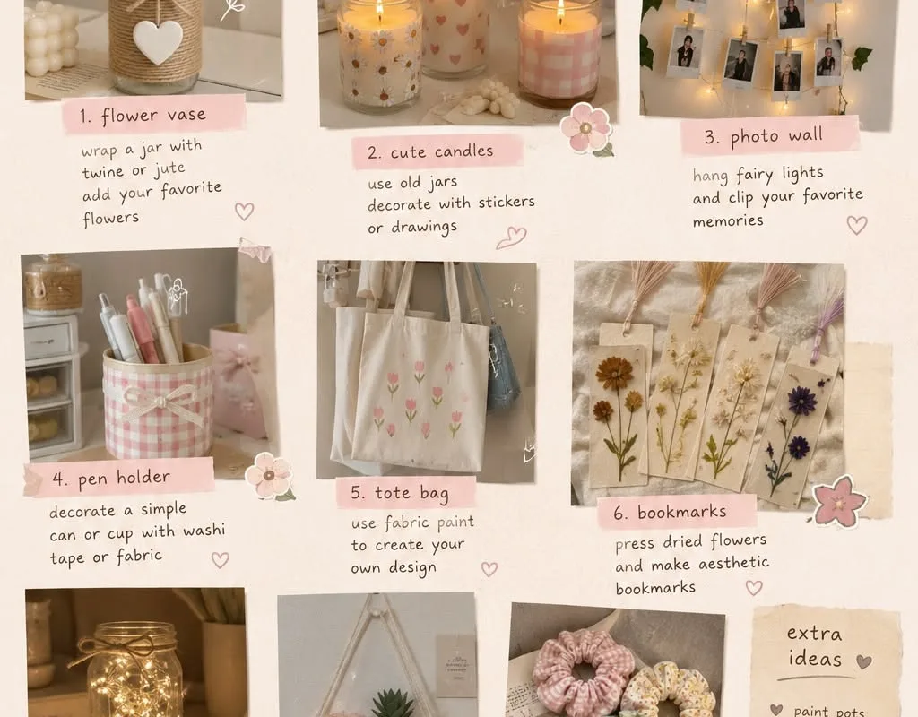
Most DIY decor fails for the same boring reason: it looks like a craft project instead of a design choice. These seven hacks fix that — each one is specific, cheap, doable this weekend, and comes with the mistake that quietly ruins it.
Advertisements1
- Matte finishes on prints, paint, and frames instantly make DIY decor look store-bought.
- Free paint chips and glass jars are legitimate art supplies — tonal gradients and inside-painted votives are the proof.
- Scale beats detail: oversized graphics and large-format prints read as intentional design.
- Hang art centered around 57 inches off the floor, the museum-standard eye line.
- Wait 48 hours after painting before taping, and 30 days before peel-and-stick wallpaper.
- Odd numbers and negative space make foraged arrangements look deliberate, not like a broom.
Hack 1: Blow Up Your Own Photos Into Gallery-Wall Art
Here's a trick photographers have used for decades: your phone camera is already better than most art you'd buy. Take a photo with strong contrast — a shadow on a wall, a single flower against concrete, a doorframe in your neighborhood — then upload it to a print service and order it as a 16×20 inch matte poster. Matte, not glossy. Glossy reflects your ceiling lights and screams "poster," while matte absorbs light and reads as a framed print.
Why it works: gallery walls feel expensive because of scale and repetition, not the art itself. Three large-format prints in identical thin black frames (IKEA's FISKBO or a $12 thrift-store frame with a coat of spray paint) create the same visual rhythm as a $600 set. The eye reads the pattern, not the price tag.
Common mistake: hanging them too high. The center of your arrangement should sit about 57 inches off the floor — roughly eye level — because that's where museum curators hang work. Most people nail at shoulder height and the whole wall floats awkwardly. Measure, mark with painter's tape, step back, then commit.
Hack 2: The Paint-Sample Wall (Cheap, Fast, Reversible)
Grab a handful of free paint chip cards from your local hardware store — the wide ones with 4-5 shades on a strip. Cut them into equal rectangles, arrange them in an ombré gradient on a plain canvas or directly on the wall using removable adhesive putty, and you've got abstract color-block art for the price of a coffee.
Why it works: color gradients are a real design principle called "tonal progression" — the eye follows the shift from light to dark and reads it as intentional composition. It's the same reason a sunset photo looks better than a random rainbow. Free chips already have professionally curated palettes, so you can't really pick a bad combination.
Common mistake: mixing warm and cool tones in the same gradient. It looks muddy. Stick to one family — all blues, all terracottas — and let the value do the talking. And if you're renting, use putty, not nails; your deposit will thank you.
Hack 3: Upcycle Glass Jars Into Layered Votive Holders
Save your pasta sauce and pickle jars, soak off the labels in warm soapy water, and you have free glass vessels. The upgrade: coat the inside — not the outside — with a thin layer of matte acrylic paint, let it dry 24 hours, then drop in a tea light. The light glows through the glass and the paint looks like frosted ceramic rather than a painted jar.
Why it works: painting the inside means the finish never gets scratched by handling, and light diffuses through the glass before hitting the pigment, which softens the color. It's the same principle behind stained-glass windows — the material filters light rather than reflecting it.
Common mistake: using gloss paint or a thick coat. Thick gloss cracks as it dries and looks like melted plastic. Two thin coats of matte, 20 minutes apart, is the sweet spot. Also: never put a real candle flame directly against painted glass without a metal votive cup inside — heat and paint don't negotiate.
Hack 4: Frame Fabric Scraps Like Abstract Art
Hit a fabric store's remnant bin — usually $2-5 for a fat quarter — and pick bold geometrics, botanical prints, or textured linen. Stretch the fabric over a cheap canvas or foam board, staple or hot-glue the back, and frame it. You've made a textile art piece in under 15 minutes.
Why it works: pattern at large scale reads as intentional design, and fabric adds texture that flat prints can't. Designers call this "materiality" — the physical feel of a surface. A framed ikat or mudcloth print gives a room the warmth of a textile without the cost of a real weaving.
Common mistake: choosing small, busy prints. A tiny floral at 8×10 inches looks like a shirt. Go big and graphic — a single oversized leaf, wide stripes, a chunky abstract — because scale is what separates art from upholstery.
Hack 5: The Two-Tone Painted Arch
Pick a wall, choose a paint color you love, and paint a half-circle arch from the floor up — about 6 feet tall and 3 feet wide — behind a chair, a plant, or a reading nook. Use a pencil tied to a string as a compass to get a clean curve, and painter's tape for the straight edges.
Why it works: arches are one of the oldest architectural shapes and they frame whatever sits in front of them, giving a plain corner a focal point. Paint is the cheapest way to fake architecture — a $30 quart does what a $2,000 built-in would.
Common mistake: skipping the primer on a dark wall, or using tape on freshly painted walls. Wait at least 48 hours after the base coat before taping, or the tape pulls the paint off in sad little strips. And pull tape while the paint is still slightly tacky, not bone dry — that gives you a crisp line instead of a jagged one.
Hack 6: Foraged Branch and Dried Flower Arrangements
Skip the florist. Take a walk, collect dried seed heads, grasses, eucalyptus, or bare branches (with permission, and never from protected land), and arrange them in a tall vase. The trick: cut stems at a sharp angle and use a 3:1 height ratio — the arrangement should be roughly three times as tall as the vase.
Why it works: dried botanicals last months instead of days, and the 3:1 ratio is a classic proportion rule that makes arrangements look deliberate rather than plonked. It's the same reason a well-proportioned lamp looks better than a stubby one.
Common mistake: overstuffing. A dense bouquet of dried stems looks like a broom. Use odd numbers — three, five, seven stems — and leave negative space. Also, shake them outside before bringing them in; you don't want a spider roommate.
Hack 7: The Renter-Friendly Removable Wallpaper Accent
Peel-and-stick wallpaper has gotten genuinely good, and one roll can transform a single accent wall or the back of a bookshelf. Measure your wall, add 10% for waste, and apply from the top down with a smoothing tool (a credit card wrapped in a cloth works).
Why it works: pattern on one wall creates depth without shrinking the room, and the back of a shelf — a spot nobody thinks about — becomes a surprise focal point every time you reach for a book. It's the cheapest way to test a bold pattern before committing to real wallpaper.
Common mistake: applying it to textured or freshly painted walls. Peel-and-stick needs a smooth, cured surface — wait 30 days after painting — or it bubbles and peels within a week. And always buy one extra roll from the same batch; dye lots vary, and a mismatched patch is heartbreaking.
The Hacks, Step by Step
- 1Measure before you buy anything
Write down wall dimensions and frame sizes in a notes app. This one habit prevents the classic "bought three frames, none fit" spiral. - 2Gather free materials first
Paint chips, jars, fabric remnants, and branches cost nearly nothing. Start there and spend money only on frames or paint. - 3Test placement with painter's tape
Tape outlines on the wall and live with them for a day. Your eye catches bad spacing faster than any measuring tape. - 4Prime and wait
Prime dark walls and let paint cure 48 hours before taping or applying wallpaper. Patience is the actual secret ingredient. - 5Use matte finishes
Matte paint and matte prints read as expensive; gloss reads as plastic. This single swap upgrades everything. - 6Go big on scale
Choose large graphics and oversized prints over small busy patterns — scale is what separates art from clutter. - 7Hang at 57 inches
Center your arrangement at roughly eye level. It's the museum standard and it just works.
DIY decor stops looking homemade the moment you control three things: scale, finish, and placement — get those right and nobody asks where you bought it.
Frequently Asked Questions
What are cheap DIY craft ideas to decorate a rental apartment?
Peel-and-stick wallpaper, inside-painted glass jar votives, and framed fabric scraps are all renter-safe because they're removable or hung with putty. None require nails or permanent changes, so you keep your deposit.
How do I make DIY wall art look expensive?
Use matte finishes, large-format prints, and identical thin frames hung at eye level. Consistency in framing and finish is what reads as expensive, not the artwork itself.
What can I use instead of buying art supplies?
Paint chip cards, glass jars, fabric remnants, and foraged dried branches cover most projects for under $10. Hardware stores give paint samples free, and remnant bins sell fabric for a few dollars.
How high should I hang DIY wall art?
Center the arrangement about 57 inches off the floor, roughly eye level. This is the museum standard and it keeps art from floating too high on the wall.
Can I paint glass jars for candle holders?
Yes, but paint the inside with two thin coats of matte acrylic and let it cure 24 hours. Use a metal votive cup inside so the flame never touches painted glass.


