

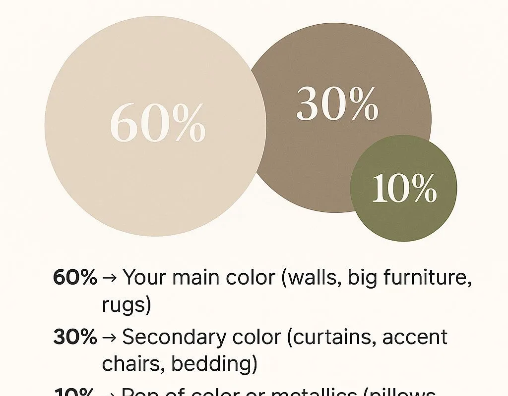
Have you ever walked into a room and felt instantly at ease, without knowing exactly why? Often, it’s the colors. The 60-30-10 rule is a simple interior design guideline that helps create a cohesive, well-balanced room without overthinking color choices. Use 60% of a dominant color for walls and large furniture, 30% for secondary elements like curtains or accent seating, and 10% for smaller pops. I remember the first time I tried it in my own living room—I was skeptical, but the result was a space that felt both intentional and effortless. If you’re craving that same harmony, this list will guide you through 21 resources and ideas to apply the rule beautifully.
Advertisements1
Table of Contents(Click to Toggle)
- Why the 60-30-10 Rule Transforms Your Space
- 21 Resources and Ideas for the 60-30-10 Rule
- 1. Sherwin-Williams ColorSnap Visualizer
- 2. Benjamin Moore Personal Color Viewer
- 3. Behr ColorSmart
- 4. ColorSnap Match App
- 5. Coolors
- 6. Adobe Color
- 7. Canva Color Palette Generator
- 8. Paletton
- 9. Color Hunt
- 10. Design Seeds
- 11. Houzz
- 12. Pinterest
- 13. Apartment Therapy
- 14. The Spruce
- 15. Domino Magazine
- 16. RoomSketcher
- 17. Planner 5D
- 18. HomeByMe
- 19. IKEA Home Planner
- 20. ColorReader Pro
- 21. Hue & Stripe Blog
- Bonus: Color Matters
- Bonus: Color Psychology
- Bonus: The Colorist
- Bonus: Maria Killam Blog
- Bonus: Colour Studio
- Bringing Balance Home
Why the 60-30-10 Rule Transforms Your Space
Color has a quiet power. It can make a small room feel open, a large room feel cozy, or a busy room feel calm. The 60-30-10 rule is not about strict math—it’s about visual weight. When you assign 60% to a dominant hue, you create a foundation. The 30% secondary color adds depth, and the 10% accent brings energy. Without this balance, rooms can feel chaotic or flat. I’ve seen friends struggle with color choices, adding piece by piece until the space feels disjointed. The rule gives you permission to stop second-guessing. It’s a gentle framework that honors your personal style while ensuring harmony. As you explore these tools and ideas, remember that the goal is not perfection but a space that feels like you.
21 Resources and Ideas for the 60-30-10 Rule
1. Sherwin-Williams ColorSnap Visualizer : See colors on your walls before you commit
What it is: An online tool that lets you upload a photo of your room and virtually paint the walls with Sherwin-Williams colors.
Category: Color visualization tool
Why it stands out:
- It uses real paint colors, so what you see is what you get.
- You can save and compare multiple palettes, making it easy to test 60-30-10 combinations.
- The mobile app includes a color capture feature to match existing items.
Best for: Homeowners ready to paint but unsure which dominant color to choose.
2. Benjamin Moore Personal Color Viewer : Upload a photo and try thousands of colors
What it is: A web-based tool that allows you to upload an image and experiment with Benjamin Moore’s extensive color palette.
Category: Virtual painter
Why it stands out:
- It includes curated color collections that align with the 60-30-10 principle.
- You can adjust lighting conditions to see how colors change throughout the day.
- The tool suggests complementary colors for accents.
Best for: Design enthusiasts who want to explore designer-favorite palettes.
3. Behr ColorSmart : Preview, coordinate, and purchase with confidence
What it is: Behr’s digital color tool that helps you visualize paint colors and coordinates them into palettes.
Category: Color coordination app
Why it stands out:
- It offers pre-made palettes based on the 60-30-10 rule.
- You can see how colors pair with flooring and furniture.
- It integrates with Home Depot for easy purchasing.
Best for: DIYers who want a one-stop solution from inspiration to checkout.
4. ColorSnap Match App : Capture any color and find its closest paint match
What it is: A mobile app by Sherwin-Williams that lets you scan real-world objects to find matching paint colors.
Category: Color matching app
Why it stands out:
- It’s perfect for matching an accent color from a fabric or artwork.
- You can build a palette from multiple scans.
- It suggests complementary colors for your 30% and 10%.
Best for: Shoppers who find inspiration in unexpected places.
5. Coolors : Generate stunning color palettes in seconds
What it is: A fast palette generator that creates color schemes based on color theory.
Category: Palette generator
Why it stands out:
- You can lock in a dominant color and let it suggest secondary and accent colors.
- It offers a contrast checker to ensure readability.
- You can export palettes to use in design software.
Best for: Designers and homeowners who need quick, harmonious color combos.
6. Adobe Color : Create color themes from scratch or from an image
What it is: Adobe’s color wheel tool that helps you build color schemes using various harmony rules.
Category: Color wheel tool
Why it stands out:
- It includes a 60-30-10 preset under the “Custom” harmony rule.
- You can extract a color theme from a photo.
- It integrates with Adobe Creative Cloud for seamless workflow.
Best for: Creatives who want precise control over color proportions.
7. Canva Color Palette Generator : Turn any photo into a color palette
What it is: A free tool that extracts a color palette from an uploaded image.
Category: Palette extractor
Why it stands out:
- It’s incredibly user-friendly and requires no design skills.
- You can use it to pull colors from a favorite rug or painting.
- The palettes can be saved directly to Canva for mood boards.
Best for: Beginners who want to derive a 60-30-10 palette from an inspiration photo.
8. Paletton : Explore color combinations with a classic color wheel
What it is: An interactive color wheel that helps you create color schemes based on traditional color theory.
Category: Color scheme designer
Why it stands out:
- It visually shows the 60-30-10 distribution with adjustable sliders.
- You can preview your palette in a mock room layout.
- It offers advanced options like monochromatic and analogous schemes.
Best for: Those who want to understand the theory behind the rule.
9. Color Hunt : Discover trending color palettes curated by designers
What it is: A free platform that showcases thousands of hand-picked color palettes.
Category: Palette inspiration
Why it stands out:
- Each palette includes four colors, making it easy to assign 60-30-10 roles.
- You can filter by popularity or newness.
- It’s a great source for accent color ideas.
Best for: Anyone seeking fresh, modern color combinations.
10. Design Seeds : Find palettes inspired by nature and everyday beauty
What it is: A blog-style site that posts daily color palettes derived from photographs.
Category: Color inspiration blog
Why it stands out:
- Each palette is accompanied by the source image, sparking creative ideas.
- The colors are often soft and livable, perfect for home interiors.
- You can search by color family.
Best for: Those who want a gentle, nature-inspired palette.
11. Houzz : Browse millions of interior photos and filter by color
What it is: A home remodeling and design platform with a vast photo gallery.
Category: Interior design inspiration
Why it stands out:
- You can filter photos by dominant color to see the 60% in action.
- It connects you with local designers if you need help.
- The “Stories” section offers practical advice.
Best for: Visual learners who need to see the rule applied in real rooms.
12. Pinterest : Create mood boards and discover endless color ideas
What it is: A visual discovery engine where you can save and organize ideas.
Category: Inspiration platform
Why it stands out:
- You can search for “60-30-10 rule” to find countless examples.
- It’s easy to create a board for your color scheme.
- The algorithm suggests similar pins, expanding your options.
Best for: Collecting and refining your color vision.
13. Apartment Therapy : Real-life home tours with color breakdowns
What it is: A popular home and lifestyle website featuring tours of real homes.
Category: Interior design blog
Why it stands out:
- Many tours explain the color choices, often referencing the 60-30-10 rule.
- It covers small spaces and rentals, showing versatile applications.
- The comments section offers additional tips from readers.
Best for: Learning from others’ successes and mistakes.
14. The Spruce : Practical guides for home decor and color
What it is: A home improvement and decor website with how-to articles.
Category: Home decor resource
Why it stands out:
- It has a dedicated article explaining the 60-30-10 rule in depth.
- The advice is beginner-friendly and actionable.
- It includes shopping guides for each color category.
Best for: Readers who want a step-by-step explanation.
15. Domino Magazine : Trend-forward color inspiration for modern homes
What it is: An online design magazine with a focus on stylish interiors.
Category: Design magazine
Why it stands out:
- It often features bold color combinations that still follow the 60-30-10 principle.
- The articles are visually rich and inspiring.
- It covers both classic and contemporary styles.
Best for: Those who want to push the boundaries while staying balanced.
16. RoomSketcher : Create 2D and 3D floor plans with color visualization
What it is: A tool for drawing floor plans and furnishing them with colored elements.
Category: Room design software
Why it stands out:
- You can assign colors to walls, floors, and furniture to test proportions.
- It offers a free version with basic features.
- The 3D walkthrough helps you experience the space.
Best for: Planning a full room makeover before buying anything.
17. Planner 5D : Design your room in 2D or 3D with ease
What it is: A user-friendly home design app that lets you create floor plans and decorate.
Category: Home design app
Why it stands out:
- It has a vast library of furniture and materials to experiment with.
- You can switch between 2D and 3D views instantly.
- It’s available on web and mobile.
Best for: Quick experimentation with color placement.
18. HomeByMe : Free online 3D interior design tool
What it is: A web-based 3D design platform that allows you to create and furnish rooms.
Category: 3D design tool
Why it stands out:
- You can apply colors to walls and see them in realistic lighting.
- It offers a catalog of real products from brands.
- Projects can be shared with others for feedback.
Best for: Collaborative design with a partner or designer.
19. IKEA Home Planner : Plan your space with IKEA furniture and colors
What it is: IKEA’s planning tool for kitchens, wardrobes, and more.
Category: Furniture planner
Why it stands out:
- It uses actual IKEA products, so you can see the 60% in context.
- You can save your design and get a shopping list.
- It helps visualize how colors interact with furniture.
Best for: IKEA shoppers who want a cohesive look.
20. ColorReader Pro : A handheld device that scans and matches colors
What it is: A portable color scanner that connects to an app to identify paint colors.
Category: Color matching device
Why it stands out:
- It provides accurate matches from major paint brands.
- You can save and organize colors into palettes.
- It’s ideal for matching an existing accent color.
Best for: Professionals and serious DIYers who need precision.
21. Hue & Stripe Blog : Color advice from a professional designer
What it is: A blog by interior designer Maria Killam, focusing on color and design.
Category: Design blog
Why it stands out:
- She frequently discusses the 60-30-10 rule and its nuances.
- Her advice is practical and based on years of experience.
- She addresses common color mistakes.
Best for: Deepening your understanding of color balance.
Bonus: Color Matters : Explore the science and psychology of color
What it is: An educational site about how color affects perception and emotion.
Category: Color theory resource
Why it stands out:
- It explains why certain proportions feel balanced.
- It covers cultural differences in color meaning.
- It’s a great reference for understanding the “why” behind the rule.
Best for: Curious minds who want to go beyond the basics.
Bonus: Color Psychology : Learn how colors influence mood and behavior
What it is: A website dedicated to the psychological effects of color.
Category: Psychology resource
Why it stands out:
- It helps you choose a dominant color that evokes the right feeling.
- It offers insights for each color family.
- It’s useful for creating a specific atmosphere.
Best for: Those who want their room to feel a certain way.
Bonus: The Colorist : A blog for color enthusiasts
What it is: A blog that covers color trends and applications in design.
Category: Design blog
Why it stands out:
- It often features interviews with designers.
- It explores color in various contexts, from fashion to interiors.
- It’s a source of fresh ideas.
Best for: Staying inspired and informed.
Bonus: Maria Killam Blog : Practical color advice for real homes
What it is: Another blog by Maria Killam, focusing on timeless color choices.
Category: Design blog
Why it stands out:
- She emphasizes undertones and how they affect the 60-30-10 balance.
- Her posts are detailed and often include before-and-after photos.
- She offers online courses for deeper learning.
Best for: Avoiding costly color mistakes.
Bonus: Colour Studio : A design studio specializing in color
What it is: A website showcasing the work of a color design studio.
Category: Design studio
Why it stands out:
- It provides case studies of color projects.
- It demonstrates advanced applications of color theory.
- It’s a source of professional inspiration.
Best for: Seeing the 60-30-10 rule applied in commercial and residential settings.
Bringing Balance Home
As you explore these tools and ideas, remember that the 60-30-10 rule is a guide, not a straitjacket. Your home should reflect your story. Maybe you’ll start by painting one wall in your dominant color, or perhaps you’ll just rearrange your accessories to see how a 10% accent shifts the mood. Small, gradual changes can lead to a space that feels effortlessly put together. I’d love to know: which color combination are you excited to try in your own sanctuary? Share your thoughts in the comments below—I read every one.
With kindness, Sofia

Sofia writes about mindful living and personal wellness, exploring habits that nurture mental and physical health. She shares gentle, realistic suggestions for creating calm in a busy world.


